It's A Burd; A Short Process Video

An experiment! This is my first shot at a short process video, created in Photoshop. A week or so ago I discovered that you can make movies in Photoshop! Who knew? Why don't people tell me these things?

It's not a perfect attempt. It is, after all, my first try at something like this. It wasn't hard to do but there has been the usual "trial and error" nonsense that slows me down every time I try to learn something new. I'm able to post this today because of determination, stick-to-it-iveness and that bout of insomnia that lifted me from bed at about 4 am today.


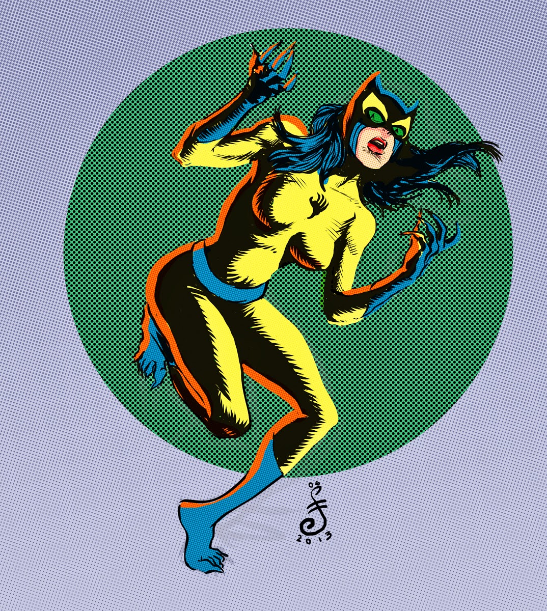
This is a 30 second overview of how I created this illustration. The scribbles were done in Photoshop, the final line artwork was created in Manga Studio 5, and then back to Photoshop for the color.

I blogged this illustration last month, so you can scroll down a few entries to see it or click here.

I'll probably do a few more of these on account of my newbie's interest, but that's likely to fade pretty soon. If you find it helpful or interesting, throw a little feedback my way! Comment here or tweet me or email me or whatever. Just a few nods of the head will probably light a fire under me for a while.

The End


p.s. I'm not very happy with the resolution on this thing and, being a rookie YouTube movie uploader and movie embedder, I'm not sure yet how to fix it. I'll get there, tho.

How come the little button thingies to make it larger aren't there? Crap. Oh, well.

New Character Design Drawing!

New drawing. Nothing grand, this is just an example of me goofing around in short-burst spare moments with an eye on trying to build up a stronger backlog of character design work.

Drawn in b&w, colors stained in haste. Then, about 20 minutes of touch up work before giving up on it

I know I should have created a more suitable couple of weapons -- not that there's ever anything cooler than a Colt and and Winchester -- but I gave myself a time limit on this and I wasn't going to make it. The guns were almost completed for another drawing I abandoned earlier, so dropping them in here was a quick & easy cheat.

Beware! The Claws of the Cat

Today I did a few drawings in Manga Studio 5. I'm practicing with it, and really starting to like it. I spent some time exploring how to modify the drawing tools, and they're much more customizable than I had previously thought. I didn't do any finished art, mostly just drawing experiments, but I finished off this doodle to give myself the feeling that I actually did something.

Drawn in Manga Studio 5, most coloring done in Photoshop.

One of the first comics I owned was the first issue of "Beware! The Claws of the Cat"with art by the great Marie Severin, featuring Wally Wood laying down his always lovely, always overpowering inks.

My original copy was lost decades ago but I picked up another one and it's even better than I half-remembered. I spent a lot of time with that book when I was a kid, and there wasn't a panel in there that was unfamiliar to me all these years later.

This was an experiment in trying to emulate that Wally Wood feathered line digitally. I hit it in some spots, didn't too do well in others. Fail and learn, fail and learn.

The End.

Named In Honor Of...

This illustration has been on slow-cook for a month or so, and I'm glad it's finally run. Originally I'd intended to have each guy driving his own little car, except for Mr. Caldecott who would be standing in a hole. It quickly became clear that it would have to be larger to accommodate such illustrative silliness, so I scaled back the nonsense.

Click to bigify

To learn what this is all about, and to read a fine story by Gary Petersontake a look here.

I'm including a few super-huge character shots below for the art wonks who occasionally look in. I tried to keep the digital painting technique kind of loose and watery. I'm pretty happy with the way most of the caricatures turned out.


A Grotesque

I only have a few short hours a week to spare, but I gave myself a Friday deadline for this horrible little thing and I''m sticking to it. I committed a coloring job that is much simpler than I hoped for, but it's all I've got. I tell ya, 1-year-old Evelyn has been an attention hog this morning, so a lot of the coloring was done with a cute little brute squirming in my lap and fighting for control of the wacom pen.

Drawn and painted in P-Shop. Open in a new window to see a very large file exposing all of the bad technique!

Working on the drawing earlier this week, I daydreamed a story for this, and I kind of like it. I'd hoped to write it up and include it here in the manner of a summarizing blurb on the back of an old sci-fi novel; you know, one of those blurbs that give away the ending!

Out of time though. Off to work in short bit. Maybe I'll do it over the weekend. Maybe I'll never do it. You know how these things go...

The End.

Swing Music

Here's a fun bit of good ol' goofy cartoonin' I did for the Bay Area News Group sports section the other day. I don't often get sports illustration assignments anymore -- I suppose it's somewhat out of style in the mainstream -- but it's something I've really missed doing.

Drawn in Manga Studio, Painted in Photoshop. Open in a new window for a HUGER view.

The story is a fun piece about baseball players' walk-up music. For those who aren't totally hip to the trend, that's the music the stadium dj plays when a batter comes to the plate or a pitcher makes his entrance. In most cases each player picks out which tune he wants to hear.

Writer Daniel Brown talked to a few guys on the Oakland Athletics and the San Francisco Giants to get some material on the story behind some of their choices. The story is here.

Artist's notes:
For the line drawing I worked entirely in Manga Studio 5. I bought MS5 earlier this year, but I just don't know it well enough to lean heavily on it while at work; newspaper deadlines can be brutal and I haven't had time to develop a familiar workflow.

Before starting this illustration, I watched a few YouTube tutorials and practiced with some of the tools I like. After a couple of hours I was able to find a good routine for drawing comfortably. It felt limited, but no more so than if I had been really brave and just drawn the damned thing on paper.

I completely enjoyed the experience of drawing with Manga Studio. I'm definitely going to try to stick with it from here on out. That said, I did resort to Photoshop for the coloring process. I haven't yet delved into the MS5 painting tools beyond a few sample strokes, and though it looks to be very powerful and very cool, I need more practice. I'm just too comfy and efficient with P-Shop for my own good.

The End.


Taking Care

Here's an illustration for a story about taking care of a loved one who no longer can take of himself. And here's the story by Joanna H. Kraus. I encourage you to read it; it's sad but it's very nicely done, and it's a topic we're all likely to have to cope with.

The concept and composition came early and easily, but I struggled with the representation of the figures. Originally they were rendered more realistically. The man was in a wheelchair, and it looked like the woman was considering pushing him down the hill. I went through several ideas before I came upon this one.

Open in a new window for a HUGE image.

As I started coloring it occurred to me the composition was reminiscent of some Brad Holland illustrations. It's certainly not as clever as most of his work, but it has a very simple arrangement of shapes. I made a very soft, spattery and hard-to-control Photoshop brush, hoping to give the impression of dusty pastel.  I enjoyed building the textures up with thousands of swirling and erratic strokes. 

On the original file the variation on the tones of the textures were more subtle, and the pattern on the hill looked much more like the sky. Here it distracts the eye a bit too much for my taste. I don't know where in the process it changed for the worse, but I should have paid closer attention to that.  But, oh well. Them's the breaks.


I like how the figures came out, even though they're a bit rough and "unfinished" compared to my usual work. Ooh. I guess I could have done a better job on his left hand. I hate zooming in on stuff that's already done and printed; I see way too many mistakes and unfinished bits.

When I sent the image to the page designer, I cropped it down. It seemed too distant and empty for a newspaper page design. Maybe I erred. Or maybe I should have made the figures larger? 


Anyway. I really enjoyed working on this one and I'm pretty happy with how it came out, regardless of my whining and second-guessing.

The End.