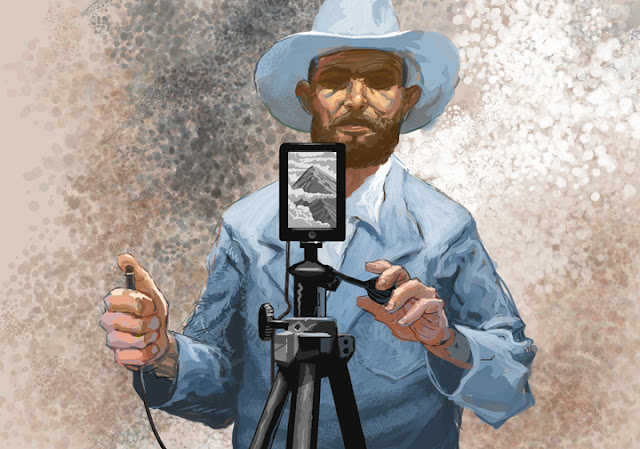
I finished the above painting just before the print deadline. For the online version below, I was able to finish his other arm. I design illustrations primarily for print and then tweak them so they will look okay for online. I probably should have roughed in some kind of background but my hand was a bit crampy and so I opted for just throwing down an ill-advised texture thingie.
So, here is how it looked in the paper:
And, just for kicks, here is the rough I made while brainstorming:
I was looking at a few pictures of young Ansel Adams when I drew this. I wasn't trying to do an obvious portrait of him, aiming instead to capture that frontier and wilderness photographer vibe. He's the standard for that, I think.


I think Ansel would have loved digital photography.
ReplyDeleteI bet you're right! And I bet he would have worn out the saturation slider in P-shop draining all the color from his photos!
ReplyDeleteClever , nicely done.
ReplyDelete