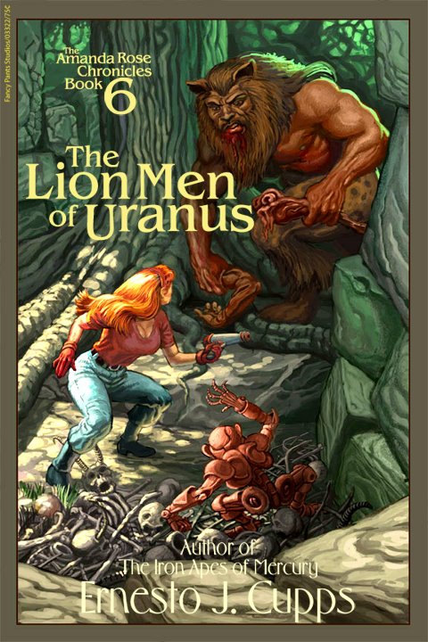
A very long and monotonous step-by-step of an old painting.This was my
first digital painting. And then I painted it again, later; so it's also
not my first, but it's a favorite of mine. Bear with me. My goal was to create a cover for a fictional science-fiction novel-- that is to say, a
real painting for a
pretend book-- and I'd never painted on a computer before.
I'd seen some very sharp-looking digital paintings on the web, and I'd read that they were done using "pen-tablets" and once you got one of those you could be Photoshop-Frazetta by sundown. I couldn't wait! I ran to ComputerWare and bought the biggest, bestest tablet I could afford-- the really tiny one. I think it ran 300+ bucks back then.
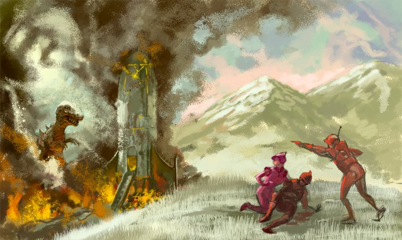
The First AttemptWith a newly acquired wacom, I ventured into unexplored territory with only a printed out tutorial or two to guide me. I scanned in a piece of cardboard and used it as the background-- I'd read somewhere
that was the thing to do-- and on a layer above, I roughed in a vague idea for what I wanted this to be.
It's obvious I had no plan beyond "make a painting." More forethought and I might have done better, but it appears I expended energy on crazy details (like the naked woman!) before I had a complete idea about where it was going. It was a struggle with an unfamiliar medium compounded by unclear intentions.
When I decided it was done I remember being (inexplicably) happy with it, but the experience had put me off. Pen lag, crashes, memory issues and a lack of knowledge on how to deal with those problems left me irritated with the process. I filed away my efforts and chalked it up as a learning experience-- as in, I learned that digital painting was not for me.
 . . . . .
Going Ape
A year passed, and I had been creating art digitally at work, making strides in my comfort level with the tablet and with the nuances of the process. Doing projects at work and bringing them home--to my smaller computer-- and working on them there-- with all of the unhappy trappings of working on a lesser machine-- taught me what the limits were, and how to get around those limits through various means of hard-earned know-how and trickery.
In my spare time I did painting exercises-- going back to school, so to speak-- practicing smooth gradations, working with opaque and transparent color, figuring out what textures were and how to use them (still working on
that, by the way); basic excercises such as painting spheres and blocks, water-drops, soft shadows, shiny eyeballs-- all that "slick" stuff I don't really care for-- but I was getting results that were finally looking like what I was going for. I started getting a grip on the computer as an art-tool.
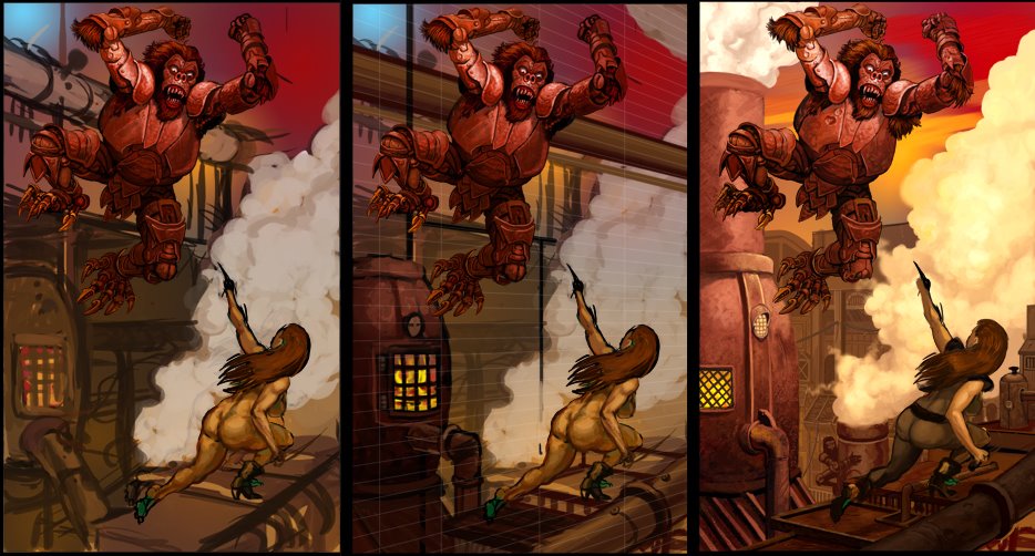
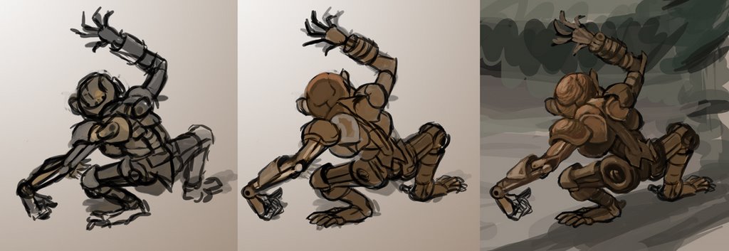
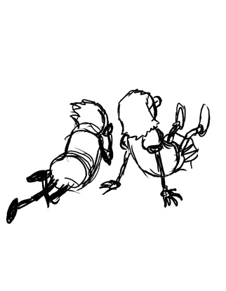
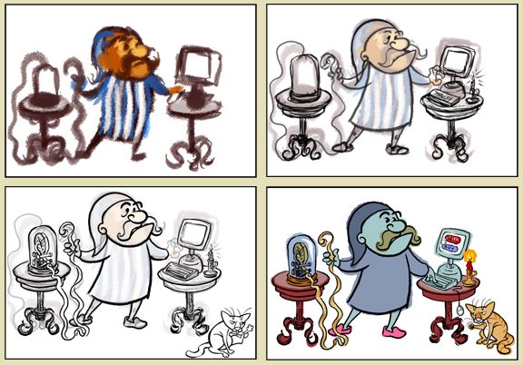
Long story short: Looking through old zip disks I found the first Iron Apes painting and I was horrified. "That," I thought, "is embarrassing." Again, it was clear I'd had no plan going in; that poorly ad-libbed landscape was amateurish and the ape didn't even look like something I would do. The
WHOLE THING looked as if it had been done by someone else-- except the girl, she looked like one of mine.
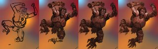
I decided to rebuild that ape in a way to make him look as I
thought he had looked when I finished it the first time. How blind I had been.
. . . . .
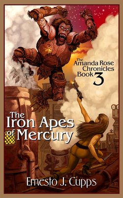
Try, Try AgainSince I had gone that far with the ape I felt compelled to do the rest of it. There was an imaginary author out there somewhere who was still ticked off at me because of the crappy cover I'd turned in previously-- Ernesto J. Cupps deserved better.
Iron apes, I decided, do not live on some half-assed lava flow, but in a grungy city of steel mills and ironworks where they forge metals and weld together their steam-driven & coal-powered spaceships. With these fitfully chugging vessels the brutal apes commit bold acts of piracy along the trade routes between planets, focusing primarily on the banana shipments from the tropical worlds, of course. It always helps to have a story when I'm working.
With the more technologically advanced environment I suppose that I
had to put pants on our heroine although it appears I was determined not to give her pants that would help her in any way. There's some kind of diaphanous body-suit going on there. It's okay, but if I were to do it again (and I'm not) I'd give her some sort of space-suit looking thing, perhaps also see-through, but it would have better pants! Or a skirt. Well, maybe it wouldn't make any more sense but it would be more "futuristic" looking.
 . . . . .
A few finishing touches and we have a slightly over-rendered painting but, I feel, it's a lot more competent than that first ugly thing.
 . . . . .
I'll try to do something new for the next post, that was my plan for this one but I lost what little free time I had to a minor disaster!
I finally upgraded my web-hosting service this past week, but when I re-uploaded my website nothing worked. I have very limited drag-and-drop-only skills for website management and this ruined my life for about two days. All my rollovers, gone, links busted and useless, and nothing I did could get them to work again. I found myself forced to almost entirely rebuild it, going step by step through the help, trying different things until I could get it to work the way it used to-- although I had to compromise a little since some things no longer work the way they used to.
"What a drag, man. Technology. What a buncha crap. And yet," he paused, pushing the upload button, "here I am."
The End
p.s. Edited a few days later to put the step-by-step photos into groups-- thereby lessening an annoying number of clicks that one would have to make to see all the bits-- and to tidy up an awkward sentence or two.

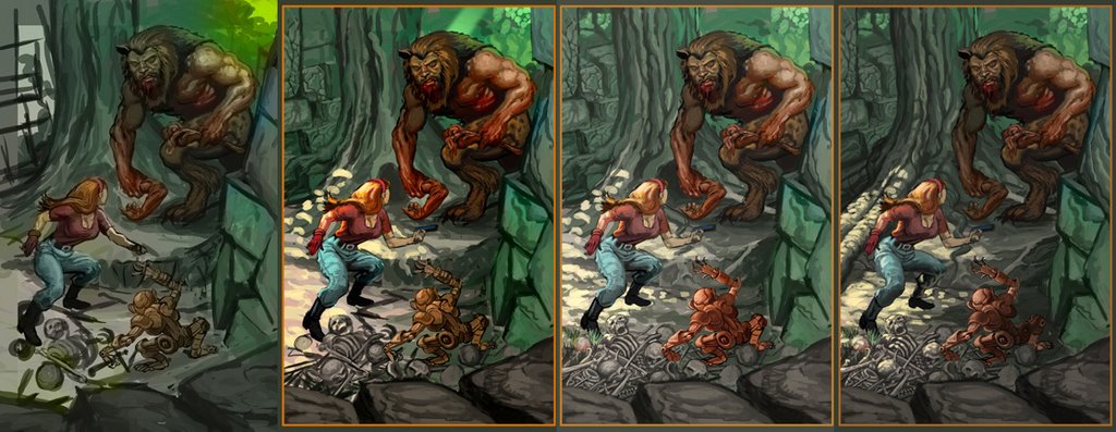
 The old one will not be shown because it looks just the same even though it's all entirely different. I may have wasted my time with this one but here it is, because I finished it.