Silly Self-Portrait

I keep running into online advertisements for Pablo Picasso's upcoming show in San Francisco. Picasso is God. I said this before, if you like his work, you HAVE to see the movie "The Mystery of Picasso." It's him, in his studio, painting. It is essential.

Last night I started a Picasso-inspired self-portrait doodle, it was just a quick line drawing of eyes, glasses, nose and curly hair. The basic lines are under all the heavy rendering here, and now it doesn't look Pablo-esque at all. But it was fun.

You know what? It sorta looks like me. Scary. For me. Maybe for you, too...

The Pond (Mud Hole)

I've never been a landscape guy. I don't know why. I love landscapes, but I haven't drawn or painted many. I've always found them difficult. Drawing people in man-made environments is much easier for me. When I'm faced with the task of drawing hills and trees and mountains, I feel a little lost. I don't have confidence in my ability to capture the sense of scale and the depth of an organic scene.

Mud hole on the way back from my hike.
I went for a long hike last week, just me and my camera. It's been about 10 years since I've gone on a walk that took more than 20 minutes. But I left the house and sauntered up and down the local hillsides for about 5 hours. It was hard going. I'm two days past that excursion and I'm still grunting and gasping in pain when I get out of my chair. I dread the trips I must make on the stairs.

Today, I had hopes of getting up and going for a walk. You know, press the advantage, get back into shape, get back into the habit, etc. Um, nope. Still way too sore. I thought maybe it would be for the best if I took up some easier hobby.  Like landscape painting.

Yeah. Much easier.

Um, Untitled

This friendly little illustration is for a story about cleansing. I'll not delve into that; I'm eating breakfast as I type. I tried to be cheerful and monumentally indirect. Oh, I certainly had other ideas (perhaps we are sharing inspirations telepathically right now, you lowbrow!), but -- or should I say, 'however' -- I did not think they would be appropriate for a family newspaper. Yes, this could have been much more off-putting and not nearly as colorful.

That's all I've got to say about this one. Next!

Summer Movies

Again, I was given the task of coming up with a cover for this week's TimeOut tabloid. Good fun! Last week, the topic was Super-Hero Summer Movies. This week, the focus changed to, um, Summer Movies! Maybe I should have just pulled Thor out of last week's cover and dropped Johnny Depp's Pirate-Guy in there.

Hindsight, eh? But this was fun, too. The rundown on the summer films is an annual shtick at the paper and I've drawn and designed for it many times. Do it a few years in a row and you begin to think you'll never come up with another idea again. After a three-or-so summers hiatus, I'm back on the job... and still stumped.

Yeah, I know, my solution here is sort of clip arty and generic, but I didn't want to do the usual "movie-still collage." ( No disrespect intended; I've made a few of those, and probably will again.) When I looked through the available images from the upcoming films, everything seemed so gloomy. All of the big-time movies are so dim and "dark and edgy" and oppressively digital-- they already look like big photoshop collages.

So, I attacked the design with relentless bright and copious sunny. I aimed for something outside of my usual range of style. I'm not comfortable or confident with this more "graphic" type of illustration, but it's fun to explore.

Toward the end I was really digging it. I thought I was doing hot stuff. But, after giving it a day to cool off, it's not that good. But I had a good time!

Next!

P.S. Since the Blogger hiccup delayed this post, I can now include the art as it appears in print:

Portrait of a Vincent Price Impersonator

Very nice. So, who is that supposed to be?
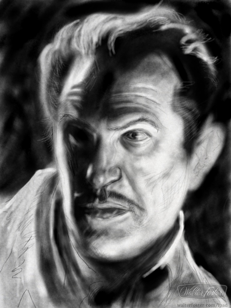
So, I'm calling this "Portrait of a Vincent Price Impersonator" because it doesn't quite look like Vincent Price. Bad eye placement. Among other things.

I got up this morning and decided to draw for the blog before heading out to work. I haven't had many opportunities to draw on the iPad so I thought I'd give it a go. It's kind of tough. Fifty minutes and one fit of frustrated rage later, here it is.

I used the "Learn to Draw Digital Sketchbook by Walter Foster," which is a free app, and I think it's pretty cool. I dig the look you can get with it. It's like charcoal on cheap paper, and I mean that it a good way.

The tools are very simple. There are three different kinds of pencil and an eraser. You can adjust their sizes, their pressure, and how hard the lead is. That's it. And the pencils only come in pencil color. It does plain drawing and it does it nicely, especially considering the price.

As an annoying bonus, you get a Walter Foster watermark as a nice surprise down there in the corner where you might want to put your signature. That's okay. If you do a lousy drawing you can just say "Walter Foster drew that."

The app has a few draw-along lessons that look like they're straight out of a Walter Foster how-to-draw book, except they move and talk to you in a friendly, you-can-do-it manner, which I like. If you enjoy the lessons you can download more how-to-draw books for six or seven bucks. I haven't done that, but even if they forego the interactive lessons and are simply recreations of the actual books, then that's a pretty good bargain. I always liked WF books, and I still have a couple I refer to now and then.

The bad news: I looked for a Walter Foster How to Draw Vincent Price lesson to download, but it looks like I'm out of luck. This is as good as it's gonna get!

Gah. That looks terrible. I rarely delete a post because of embarrassing art, but this may happen. I must have courage! Courage. Bleh.

The End

An Oldie But A G... Well, An Oldie!

I've had a couple of extremely busy work-weeks and I've managed to do absolutely zero artwork at home. I'm hoping to solve the time & energy equation soon.

In the interest of making this blog seem like it's the project of a living, happy, vital artist, I'll yet again post some old, zombie artwork to fool you.

This one ran back in 2006, and I don't remember much about it, but I'll bet I was aiming for this to look like it was done by Thomas Hart Benton and/or Gary Kelley. Ended up looking like one of mine, though.

I have a memory of changing the colors in the beakers from purple to red to green, and creating the bubbles in there. That was fun. The story was about Cal and Stanford and their commitment to keeping the "student" in "student athlete."

The guy on the left seems like a chubby little fellow, doesn't he? I'm resisting the urge to redraw him right now. No time! Off to work!

*       *       *       *       *
Here is the how the drawing was used in the paper -- I had nothing to do with the layout, I'm sure. That's all Page Designer, but I don't remember who that was. I think there were a couple of different layouts for this package in other editions, but this is the only one I've got a digital copy of. It looks pretty good! Except for the Cal guy's peculiar shape. I've got to let go of that.

Summer Movie Super-Heroes

The area inside the frame is approximately how it'll print.
Here's the uncropped artwork for this week's TimeOut entertainment tabloid. It was a busy couple of days in the newsroom while I worked on this -- as you might imagine (thanks a lot Navy Seals!) -- and a few hours before it was due, I had doubts about getting it finished. But you know what? I made quick work of it and had some time to spare.

Maybe I should have gone back and polished it up a little. Eh, I like the roughness.

It sounds like "Thor" is going to be pretty good. Contra Costa Times graphic novel reviewer Randy Myers liked it a lot. I can't think of a time I've disagreed with his comics appraisals, so I'm betting I'll dig it when I get around to it.

I confess that I avoid comics movies. I have a hard time warming up to modern visions of the stuff I enjoyed as a kid. I fear that I'll be disappointed if the Thor movie doesn't look like it was drawn by Jack Kirby or Walter Simonson. But that's just me. I hope it does well and everyone enjoys it so much that they go out and buy the gigantic collected edition of Simonson's work from the 80s. Hopefully it will be heaviest book ever to reach #1 on the NY Times' book list.

What I've seen of Cap and Green Lantern looks okay, if I let go a little. I'm not a big GL fan by any stretch, but I loved the Gil Kane artwork in the old reprints. Cap? It's Kirby or bust, for me. Well, Englehart and Sal Buscema had a bunch of good stuff. And those issues drawn by Frank Robbins are more than awesome. And Byrne did a good Cap back in the late 70s. Geez, I think I'm old.

The End

Junky Little Drawing

I'm in the midst of a crazy, every-day-is-a-long-day kind of week. I haven't had much energy left over after the commute grind. But over the past few weeks, in short bursts, I have been tweaking and updating my website.  Click here to the see the new set-up. It's still in flux and the "PORTFOLIO" section isn't put together yet, but it's an all-new look and a change of online strategy for me. Please drop a line or a comment with a critique if you hate/like it.

My cat-pal, Maggie. The back of her head. My feet.
Fill-in art

I did this little scribble on the iPad a week or two ago. I used a freebie app called "draw." It's very basic and it's not very sensitive or accurate to the stroke of the pen -- finger, whatever -- but I like it's simplicity. You get 8 color pencils to use and an eraser and... well, that's about it. You can save your drawing to your photo album, but when you start on the next drawing, the first one is gone. Cool!

I'd like to try to do something a little nicer with it, but so far this is it. Maggie was a good sport and didn't move much as I rested the ipad against her back.

Just think of it as a digital sticky-note doodle and maybe it won't seem too crummy.