2013 Hasn't Been That Great For The Blog, Has It?

Is the blog still alive?

It’s obvious the habit has been broken. The blog began its eighth year in February, but 2013 has been the least productive by far. I’ve managed less than 30 posts and about half of the images are accompanied by tedious complaints about how I’m not finding time to draw or blog. Kind of like this one, I guess. Who wants to read that crap?

Back in September I was very depressed by how it was going. I started preparing the blog’s formal obituary notice – if it's no longer any fun why not just kill it? – but I haven’t had the heart to finish it. I occasionally look in on the blog as though it were an old, sick friend. I smile and check the pulse. “Hey, 13 visitors today. Oh! And 45 last Thursday? That’s not bad, eh?” And the blog coughs, and mumbles something I can't make out. I pat it gently. “There, there, you’ll be alright.” And then I make sure the “Do not resuscitate” tag is still tied firmly to the toe before quietly moving on to another web page.


Here are a few heads I doodled up in Photoshop the other night. Just goofing around.

Very good and pretty bad

I have a 20 month-old daughter and she has been alert, mobile and needing a father’s attentive eye during the morning hours I used to fill by creating personal art. She is transforming into a person, and the days of dropping her into a crib and rocking her to sleep are long gone. We go for walks every morning. She sits in the stroller and points at cars and trees and dogs; or she’s exercising her little legs at the park, running about in a wobbly manner and terrorizing the ducks who inexplicably don’t hear her coming. This is not a complaint. She is some of the best fun I've ever had and it's a joyous privilege to have this time with her.

My job, on the other hand, still affords opportunities for illustration but there has been a decline in the type of assignments I enjoy. As the newspaper business continues to change, I can foresee a time where creating art will be such a small part of what I do that I won’t be able to think of myself as a working artist anymore. To be honest, I’m feeling that way now and I'm struggling with finding a solution for the disappointment.

I’ve done a few illustrations at work since my last blog post, but I haven’t been happy with them. It has been extremely frustrating, but it has ignited an enormous urge to do work that I have more passion for. I have two small projects I’ve been cultivating during bouts of insomnia for the past year and I hope to show new stuff soon.

From slogging to blogging

The blog isn't quite dead. Why should it be? As long as I still have a hope that someday I might become a real artist, then there's no reason why I can't just wake up the slumbering blog when I want to play with it. I've found it's always a matter of momentum when it comes to this habit. Post three times in a week and a fourth becomes easier. Skip November and missing December is a piece of cake.

I'm confident 2014 will be a huge uptick for the blog and – with a bit more concentrated effort – my professional life will begin to achieve the kind of fun I'm having in my home life.

The End of 2013

Disjointed Connections

Digital illustration for a Troy Woverton story that ran in the Bay Area News Group newspapers' Technology section on Monday, Oct. 13. Click here to read the story.

Open in a new window for a much larger version.

Without purposeful intent I've been experimenting with a flatter style of illustration lately. My next effort will also be that way, but intentionally so. I've been feeling bored by my work and this is a strategy way to revive my interest in drawing. 

Here's how it ran in the paper!

I have enjoyed the process. I'm not completely happy with the pieces so far but I feel like I'm learning something new, and it's refreshing to be surprised by what I have when I finish.

The End.

Always On

Here is an illustration that ran today – Monday, October 6 – in the San Jose Mercury News Technology section.

The story by Patrick May (click here for the link) is about coping with the stress brought on by our reliance on today's popular personal technology. In the article Patrick considers a variety of our anxieties and their causes. We just can't get away from it all, can we? Not that I'd want to, to be honest.

Drawn in Photoshop, this version of the illustration ran online.

The tech-worry I have right now is upgrading my iPad2 to iOS7; I'm holding on to iOS6, thank you. I mean, what if it jacks up my favorite games? 


This version, a bit taller and with the tech-devices flipped, ran in the paper.

The End.

Hey! Another Old Doodle!

I just found this on an old computer of mine. I don't think it has ever been seen on a screen other than that of a Lime Green 233 mghz tray-loading iMac back in 2002. And now, dear internet, I give it to you:

Open in a new window for a MUCH larger image!

Probably painted in Photoshop 5 or maybe 6. 

Know What They Know

This is an illustration for a story about accessing the information that companies have gathered about you as a result of monitoring your internet activity. Or something kinda like that. For the full scoop read Brandon Bailey's story on the San Jose Mercury News website right here.

Click to open in a new window for a HUGE file to view.

Above is the final art and below is the rough. Drawn mostly in Manga Studio and colored mostly in Photoshop!

Don't bother clicking. It doesn't get any larger.

The end.

Me, In Action!

I can see the attraction of creating animation. It's never really grabbed me before, but now? I think I've been pleasantly grabbed. There's a better way of putting that, but I can't come up with it before coffee.

My creation is a humble creation, yet getting this far has taught me a lot. Because of the research I've done to learn how to make this, I also am aware that animating in Photoshop (and in old Photoshop CS4 to boot) is not the way to advance this skill set. However, since I have nothing else at the moment, I'll probably just muck about in the old sty for a brief period and build on this ever so slightly.


The idea behind this effort was to make a quick, animated logo for my website -- with this little animation and animated text -- but that was way too complicated for my first attempt. I can see how to do it now, but I don't have the time at the moment to make that happen. So, this is what I've got today.

The End

It's A Burd; A Short Process Video

An experiment! This is my first shot at a short process video, created in Photoshop. A week or so ago I discovered that you can make movies in Photoshop! Who knew? Why don't people tell me these things?

It's not a perfect attempt. It is, after all, my first try at something like this. It wasn't hard to do but there has been the usual "trial and error" nonsense that slows me down every time I try to learn something new. I'm able to post this today because of determination, stick-to-it-iveness and that bout of insomnia that lifted me from bed at about 4 am today.


This is a 30 second overview of how I created this illustration. The scribbles were done in Photoshop, the final line artwork was created in Manga Studio 5, and then back to Photoshop for the color.

I blogged this illustration last month, so you can scroll down a few entries to see it or click here.

I'll probably do a few more of these on account of my newbie's interest, but that's likely to fade pretty soon. If you find it helpful or interesting, throw a little feedback my way! Comment here or tweet me or email me or whatever. Just a few nods of the head will probably light a fire under me for a while.

The End


p.s. I'm not very happy with the resolution on this thing and, being a rookie YouTube movie uploader and movie embedder, I'm not sure yet how to fix it. I'll get there, tho.

How come the little button thingies to make it larger aren't there? Crap. Oh, well.

New Character Design Drawing!

New drawing. Nothing grand, this is just an example of me goofing around in short-burst spare moments with an eye on trying to build up a stronger backlog of character design work.

Drawn in b&w, colors stained in haste. Then, about 20 minutes of touch up work before giving up on it

I know I should have created a more suitable couple of weapons -- not that there's ever anything cooler than a Colt and and Winchester -- but I gave myself a time limit on this and I wasn't going to make it. The guns were almost completed for another drawing I abandoned earlier, so dropping them in here was a quick & easy cheat.

Beware! The Claws of the Cat

Today I did a few drawings in Manga Studio 5. I'm practicing with it, and really starting to like it. I spent some time exploring how to modify the drawing tools, and they're much more customizable than I had previously thought. I didn't do any finished art, mostly just drawing experiments, but I finished off this doodle to give myself the feeling that I actually did something.

Drawn in Manga Studio 5, most coloring done in Photoshop.

One of the first comics I owned was the first issue of "Beware! The Claws of the Cat"with art by the great Marie Severin, featuring Wally Wood laying down his always lovely, always overpowering inks.

My original copy was lost decades ago but I picked up another one and it's even better than I half-remembered. I spent a lot of time with that book when I was a kid, and there wasn't a panel in there that was unfamiliar to me all these years later.

This was an experiment in trying to emulate that Wally Wood feathered line digitally. I hit it in some spots, didn't too do well in others. Fail and learn, fail and learn.

The End.

Named In Honor Of...

This illustration has been on slow-cook for a month or so, and I'm glad it's finally run. Originally I'd intended to have each guy driving his own little car, except for Mr. Caldecott who would be standing in a hole. It quickly became clear that it would have to be larger to accommodate such illustrative silliness, so I scaled back the nonsense.

Click to bigify

To learn what this is all about, and to read a fine story by Gary Petersontake a look here.

I'm including a few super-huge character shots below for the art wonks who occasionally look in. I tried to keep the digital painting technique kind of loose and watery. I'm pretty happy with the way most of the caricatures turned out.


A Grotesque

I only have a few short hours a week to spare, but I gave myself a Friday deadline for this horrible little thing and I''m sticking to it. I committed a coloring job that is much simpler than I hoped for, but it's all I've got. I tell ya, 1-year-old Evelyn has been an attention hog this morning, so a lot of the coloring was done with a cute little brute squirming in my lap and fighting for control of the wacom pen.

Drawn and painted in P-Shop. Open in a new window to see a very large file exposing all of the bad technique!

Working on the drawing earlier this week, I daydreamed a story for this, and I kind of like it. I'd hoped to write it up and include it here in the manner of a summarizing blurb on the back of an old sci-fi novel; you know, one of those blurbs that give away the ending!

Out of time though. Off to work in short bit. Maybe I'll do it over the weekend. Maybe I'll never do it. You know how these things go...

The End.

Swing Music

Here's a fun bit of good ol' goofy cartoonin' I did for the Bay Area News Group sports section the other day. I don't often get sports illustration assignments anymore -- I suppose it's somewhat out of style in the mainstream -- but it's something I've really missed doing.

Drawn in Manga Studio, Painted in Photoshop. Open in a new window for a HUGER view.

The story is a fun piece about baseball players' walk-up music. For those who aren't totally hip to the trend, that's the music the stadium dj plays when a batter comes to the plate or a pitcher makes his entrance. In most cases each player picks out which tune he wants to hear.

Writer Daniel Brown talked to a few guys on the Oakland Athletics and the San Francisco Giants to get some material on the story behind some of their choices. The story is here.

Artist's notes:
For the line drawing I worked entirely in Manga Studio 5. I bought MS5 earlier this year, but I just don't know it well enough to lean heavily on it while at work; newspaper deadlines can be brutal and I haven't had time to develop a familiar workflow.

Before starting this illustration, I watched a few YouTube tutorials and practiced with some of the tools I like. After a couple of hours I was able to find a good routine for drawing comfortably. It felt limited, but no more so than if I had been really brave and just drawn the damned thing on paper.

I completely enjoyed the experience of drawing with Manga Studio. I'm definitely going to try to stick with it from here on out. That said, I did resort to Photoshop for the coloring process. I haven't yet delved into the MS5 painting tools beyond a few sample strokes, and though it looks to be very powerful and very cool, I need more practice. I'm just too comfy and efficient with P-Shop for my own good.

The End.


Taking Care

Here's an illustration for a story about taking care of a loved one who no longer can take of himself. And here's the story by Joanna H. Kraus. I encourage you to read it; it's sad but it's very nicely done, and it's a topic we're all likely to have to cope with.

The concept and composition came early and easily, but I struggled with the representation of the figures. Originally they were rendered more realistically. The man was in a wheelchair, and it looked like the woman was considering pushing him down the hill. I went through several ideas before I came upon this one.

Open in a new window for a HUGE image.

As I started coloring it occurred to me the composition was reminiscent of some Brad Holland illustrations. It's certainly not as clever as most of his work, but it has a very simple arrangement of shapes. I made a very soft, spattery and hard-to-control Photoshop brush, hoping to give the impression of dusty pastel.  I enjoyed building the textures up with thousands of swirling and erratic strokes. 

On the original file the variation on the tones of the textures were more subtle, and the pattern on the hill looked much more like the sky. Here it distracts the eye a bit too much for my taste. I don't know where in the process it changed for the worse, but I should have paid closer attention to that.  But, oh well. Them's the breaks.


I like how the figures came out, even though they're a bit rough and "unfinished" compared to my usual work. Ooh. I guess I could have done a better job on his left hand. I hate zooming in on stuff that's already done and printed; I see way too many mistakes and unfinished bits.

When I sent the image to the page designer, I cropped it down. It seemed too distant and empty for a newspaper page design. Maybe I erred. Or maybe I should have made the figures larger? 


Anyway. I really enjoyed working on this one and I'm pretty happy with how it came out, regardless of my whining and second-guessing.

The End.

That Unfinished Comics Page I Posted A Couple Months Back?

Got around to finishing the thing last night.

It comes from nowhere, and goes nowhere. What is here is all there is of this, and there will be no more of that. That said, it's done, whatever it was.

Open in a new window for a slightly larger and perhaps readable view.
Drawn in Photoshop.

The End

Look, Up In The Sky It's A Bird! It's A Plane! No, It's A Burd!

Here's a drawing done for the San Jose Mercury News Sunday business section. The story, by Heather Somerville, can be found here.

Open in new window for SUPER-HUGE image!

Steve Burd, the CEO of Safeway will be retiring soon, and the article explores his legacy. Was he super-heroic, or was he as helpful as a hole in a bag?

Concept, design and layout by Daymond Gascon and Chuck Todd; I got to do the fun and easy part!

On this occasion, I drew a rough in Photoshop and moved to Manga Studio 5 for most of the drawing and inking. I was going to color in MS5 but I haven't worked with it on deadline before, so I fled back to the comfort of Photoshop when I got lost amongst the unfamiliar quick-keys and mysterious brush controls!

Here's about how it will look if you find a newspaper out in the wild, except it's missing the fold in the middle.


The End

Posterous Is Dead

I started posting at Posterous in 2011. The blog you are reading -- a sturdy old BlogSpot production -- was and is my formal blog, and I started using Tumblr for quick, informal blog-spasms. I didn't quite know what to do with Posterous, but I didn't want to be left out if it blossomed into something way cool!

Well, I didn't see much action or activity there. Within a few weeks, Posterous faded from my routine and from thought. In all, I only managed five posts there, and I would never have thought about it again, but for the email I received from them yesterday informing me that they were shutting down. What a surprise!

So, in remembrance -- lest I forget to ever remember them again -- here are the pieces I posted to Posterous. They might exist in some form on the this blog's past, but I don't want to expend the energy to looking for them.

It looks like I just zoomed in and took detail shots of my work.
That's a cheap way of padding a blog. Hmm. Kind of like this post, maybe...

And the following piece -- which definitely is on this blog some where in the past -- is a rerun but, for the Jeff Durham Posterous Collection® completists, I include it here.

Self portrait of Me, working late on the job.


The End.

Impression of Evelyn

While she naps, I paint a quick impression of the daughter. Unintentionally kind of spooky. Oh, well.

Painted in Photoshop, about 15 minutes. Open in new window for a HUGE! image.

Haven't painted in a long time. Maybe the picture isn't so hot, but it sure feels good to do it.

The End

Predicting Silicon Valley's Future

On a Wednesday evening, in haste -- for the end of shift was near -- I doodled this thumbnail after a brief brainstorming session with the art director and page designer. I submitted it to the editors for approval and went home.

I stole the hand from the illustration in my previous
post and scribbled the rest in about 10 minutes. 

The next day, in the early afternoon, the idea was approved. At 12:58 p.m., this sketch was all I had. By 6:45 I was done:

Open in a new window to see a MUCH larger image!

Whooosh! That was pretty quick. I spent another 40 minutes tweaking it for two online presentations, changing it from a vertical to a horizontal design, which necessitated a little more drawing, but I'm not counting that!

Here is what it looked like in the paper after Daymond Gascon put the page together. He made it look nice, didn't he?


And here is the link to Mike Cassidy's excellent story.

The End.

Rolling Stones Tickets Are Hella Expensive

Here's my effort at an illustration for Jim Harrington's fine story about concert ticket prices. If you read the story I must warn you that the next time you exit the subway and pass by that old guy sitting on a bucket playing an erhu, you might feel compelled to drop at least a 20 in the cup. After all, you're getting front-row, v.i.p. access to live music performed by someone over 70.

Open image in a new window for a GIANT! version. It's much easier to see the sloppy handiwork.

Below are four screenshots of the illustration in progress.

Top left: My rough idea sent to the editors for approval. A hopefully amusing play on the audience-raising-lighters-at-a-concert shtick, with one guy in the foreground burning money representative of the amount of a ticket. The editors liked it, but wanted more people burning money. Dang. That means drawing more hands doing different things.

Top right: Mick and Keith line drawings -- at this point I wasn't crazy about Mick's likeness, but I hoped to fix it during the coloring process.


Open in new window for a bigger picture, if you're that interested.

Bottom left: I started filling in the flat colors behind the linework after the long slow grind of drawing hands. I had also drawn hands holding money, but they were on hidden layers; I kind of preferred the visual joke of having just the one pair of hands lighting the money, and kept this as an option in case it was later decided to go that direction.

I did re-use a hand or two, but redrew a few fingers on each so it wasn't so obvious.

Bottom right: Here the rendering began. Mick's face started to look better after this, although I'm still not happy with how the final looked, but deadlines will be deadlines. At the last minute I decided I didn't care for the big, bare fore-arms right up front, so I put some sleeves on them, probably with a bit too much haste. The coloring helps, but they look more like tubes than sleeves.

Also, at the very last minute I put frets on Keith's guitar. No time for strings, tho!

And here is what it looked like in the paper, on a page designed by Scott Swyres:

Don't bother clicking, it doesn't get any bigger.


The end

The Artist Resurfaces...

"Over thar! Off the port bow! He's posted an artworks, laddies. How can he have stayed down so long? Is he breaching? Is he going to thrash the ship with his mighty tail? Or has he expired? Mayhap he is merely bobbing to the surface to show his belly to the sun and feed the gulls."

I am still in the cold, cold grip of a monumental art-slump. I haven't scribbled anything of merit since my last post several weeks ago, and I won't insist on the "merit" bit if you feel differently. Still, I have hopes. I will be off of work for a few days and I have aspirations and I have a pencil. That is all an artist needs, right?

Don't bother clicking, it doesn't get any bigger.

In the interest of keeping the blog floating -- be it belly-up or not -- here is a small scan of a mid-90s acrylic painting I did on the cover of a small 3x5 sketchbook. That should be enough for at least one gull.

The End.

Cartoon Portrait!

Me & E. We got up early and couldn't go back to sleep. Today will be a long slog, to be sure.


The end.

Trying To Get It Going

Total frustration has set in when it comes to getting any traction in creating my own personal artwork. I HAVE to start pushing and get some done. I'm going to try to post something every day or two. It won't always be good, but maybe bad art hanging on the internet wall will help drive me.


These are screen snaps from a couple of panels on a comics page I started last week. I worked on the giant guy in armor a little bit this morning. And now... damn. Off to work. Grumble.

The End

TV Binge? I Confess. I've Done This.

I may have mentioned this 200 times before, but I hate television. "Hate," some say, is a hard word and rarely should it be used, and I agree; but even that word, applied with premeditation and with the respect for the true feelings of disgust it should convey, is far too tame for the angry loathing I feel for television. Earlier in life I unplugged my TV with a snarl and unplugged it remained for nearly a decade.

I've relaxed my stance slightly. The television gets plugged in for the occasional football game and the World Series, but my temper is tested by the wretched tide of repeated commercials; particularly those pleading for me to watch a sitcom or singing contest. Please. I will never! watch your show. Unless.

Drawn in Photoshop. Putting the cans of soda on the toaster oven is probably a bad idea. Please switch the slice of pizza and the six pack in your imagination and save me the trouble of redrawing it. Thnx!

A friend gave me Battlestar Galactica season 1 on DVD. Thank you, I said, and put it on my shelf. There it stayed for more than two years. But one night, after a very long and frustrating day at work, I came home mad and hungry. I made a quick dinner and put the first DVD into the computer, just to trick myself into thinking about something else. It worked. The show was great.

I was up all night. No. Really. All night and into the late morning of the next day. No sleep. I staggered back to work, tired and twitchy. If you watch a TV show in a dark room for twelve or thirteen hours and then go sleepless back into your working life, every moment has an out-of-body quality that makes talking, walking and thinking seem wearily bothersome. Your eyelids have the impression that they're just not supposed to shut anymore, so blinking on purpose becomes the most important thing you have to remember to do.

I made it through the day, drove home safely, and, yes, watched several more episodes. I didn't finish the whole first season without sleeping, but I powered through in three days without missing a shift at work. I must have been prompted to such irresponsible irrationality by something close to love. Maybe it was love; that was the first television show I was fully committed to since Twin Peaks. Twin Peaks was canceled in 1991? 92? True love, for me, is rare but it bites deep.

So, getting back to the purpose of the blog, Hey! I drew this picture! Chuck Barney wrote this story about how some people avoid broadcast television shows so they can watch an entire season or an entire run in a very short amount of time. I completely grok.

Rough sketch (left), refined drawing with flat color (center), and, on the right, the illustration in-progress when I was still trying to figure out how I was going to paint this.

No, this isn't a caricature of me watching Downton Abbey with a lap cat and a pile of supplies, but it will be once season 3 hits streaming on Netflix! The first two seasons were fab. Don't tell me who dies! Don't tell me who dies in season 3 of Walking Dead, either. Those are the next TV binges on my list.

The End

p.s. Moments ago, as I type, I watched the last episode of Caprica. It's taken me a few weeks to get through it, as I have learned to be patient and pace myself.


New College Try

Here is an illustration that ran on the February 24th Sunday front of the Oakland Tribune, San Jose Mercury News, Contra Costa Times, the Daily Review, the Argus, and um, the ... well, all those Bay Area News Group papers. (Nobody's really sure how many there are.)

A digital drawing accompaniment to a fine story about online education by Katy Murphy.


Here is how it looked in the paper:


The End

Seven Years of Blogging

Today, the 19th of February, marks the end of this blog's 7th year. I hesitate to say that today also marks the beginning of the 8th year because I haven't been a very good blogger of late and Year 8 might be a very weak character.

I'm not planning on stopping entirely, but I may take a long break, or perhaps I'll open up a new blog somewhere else. I think I need a change of scenery, or a new start; that might be reinvigorating! Or maybe I'll upload a new banner and get back to posting regularly tomorrow. I have no idea.

I made these biscuits back in November. They are little stale, but they still look kind of fresh!

I'm in a horrible art-slump. I haven't made the time or found the energy for my own projects, and I haven't been digging the work I've done on the job at all. 

I'm pretty certain I have a touch of that mid-life crisis thing going on. Am I doing what I want to do? Do I know what I want to do? Should I quit my lousy job and work at the local bookstore only to find out that is an even lousier job?

Wait. The bookstores are all gone. I guess I have to keep doing what I'm doing. Or do I?

Don't mind me. I haven't had a proper whining session or an on-internet meltdown in a long time.

Happy 7th, Blog! 

The End?

Maybe You Should Get A Real Camera

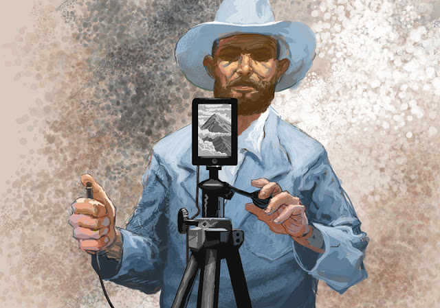
This is a digital painting I did last week for Troy Woverton's story about why you might want to invest in a digital camera and not just rely on your smartphone for taking pics.

There is a cluster of similar-sized triangle shapes with the lapels,
the collar and the mountain on the screen; that's kind of bad design
but I didn't notice it until the very end. I wish I could have fixed
that, or maybe played it up so I could say I did it on purpose. 

I finished the above painting just before the print deadline. For the online version below, I was able to finish his other arm. I design illustrations primarily for print and then tweak them so they will look okay for online. I probably should have roughed in some kind of background but my hand was a bit crampy and so I opted for just throwing down an ill-advised texture thingie. 


So, here is how it looked in the paper:


And, just for kicks, here is the rough I made while brainstorming:


I was looking at a few pictures of young Ansel Adams when I drew this. I wasn't trying to do an obvious portrait of him, aiming instead to capture that frontier and wilderness photographer vibe. He's the standard for that, I think.


Just A Doodle

Here are a couple of panels that don't mean anything. I did these in an attempt to jump-start my personal work. I spent about four hours on this over the course of a week. I started to color it but I decided that I'd spent enough time on it, and I don't think color would have helped it much.

Drawn, painted in Photoshop!!


Happy New Year!

The End