Tired of the holidays yet?

Our paper invited the readers to submit humorous lyrics set to the music of holiday tunes. There was some pretty good stuff in there.

I created this image in Photoshop.


The end.

Party On!

Illustration for a story on how NOT to behave at an office party– but not everybody is going to read it and take the advice, so the rest of us will still have something horribly embarrassing to talk about.

For this piece I drew all of the characters, individually, on real paper and scanned them in. Just plain old pencil and photoshop! I'm enjoying the drawing I do away from the computer and I think the old looser, more relaxed line is finding its way back into my work.

I regret not having attacked this illustration with more vigor at an earlier date– I had to finish it up much more quickly than I anticipated due to bad planning on my part. I envisioned about 6 more characters and a slightly different composition but I think it came together pretty well in spite of my efforts to fail.

For some reason– and I know better than this– I drew each character, scanned it in, colored it; then the next character, draw, scan, color. I should have drawn them all first, scanned, designed the composition and then attacked the coloring. I found myself going back and re-coloring stuff as I tried to arrange the layout on the go. Bad.

Still, I had fun with it. Beats working.

The End.

Shopping Season


This is a really quick sketch I did at work on Saturday afternoon. Really quick. I was laying out a graphic and needed some art to fill a peculiar space. Ta daa. Pencil and Photoshop!

The end.

p.s. I just decided to try the new blogger upgrade beta thingamajig. That's why things are looking different. I don't know much about webstuff but it seems pretty easy and not too confusing. Of course it will take some time before I settle on a stable presentation. I'll probably end up going back to the original but at least my interest is piqued for a day or two!

Infographical Thingamabob

This is a graphic I did for the paper this week. I haven't done many hard-core info-grahpics before– well, maybe a couple– but this was the most fun I've had doing one yet. Lotsa painting!


Photoshop with a touch of illustrator.

THE END.

I HATE TV!

This is the way I feel. Hate it. So, when the editors at work asked me to illustrate this idea for a story it popped out and onto the page (screen) sooo easily.

I plugged in my little TV last week for the first time in a long time and tried to watch the Colts/Patriots game, just because, well, how could you go wrong? Colts! Patriots!

Ugh. Pretty good game but the commercials beat me into submission. I was so worn out I almost turned it off in the 3rd quarter. So many dumb commercials and so many repeated pleadings to watch their crummy TV shows. Every pause between plays was crammed full of "CSI" and "ER" (or whatever) advertisements.

I've unplugged the TV again and put it back on the shelf, and it's likely to stay that way for a long time. Until the next Colts Patriots game, I figure! Or until I feel the need to play my old Sega Genesis.

Painted in Photoshop! It runs this Saturday in the Contra Costa Times and the affiliated papers.

The End.

Politically Polite


Photoshop illustration for a story about getting along with your fellow humans of differing political persuasions during the election season.

Doodled in photoshop.

And today?

A couple days back I found copies of Marvel Fanfare #'s 1 and 2 hidden away on a bookshelf; Michael Golden drawing Spider-Man! I remember when it came out 24-25 years ago! Gasp! That long?

It's still cool and it still makes me want to get out the crayons and draw pictures of Spider-Man!

So I did.

Monster Heads

I started to work on an illustration for Halloween. These heads, however, are FAR too creepy to even consider using them in some way. I'll just put these away– right here in the junk drawer– and start working on something friendlier.


The End.

Well, How About This?

I am thigh-deep in the thickest of slumps when it comes to off-duty art. For over a month I haven't found more than a few moments where free-time, the will to draw, and pen have crossed paths. It's disheartening but I'm going to get there.

So here's a sneak peak at an illustration I did a week or so ago for work. It hasn't run yet but it'll probably see the light of day next week some time.

Election Illustration Final

Here is the final illustration for the Contra Costa Times election special section. Fun to do. I hope somebody out there likes it!

Jasper's Last Charge

I love those old novels that have the illustrations with the captions under them. In my youth I would, of course, flip through the book and check out the drawings before reading, and if there was a picture that was particularly exciting, I'd skim quickly to find the part of the story it was depicting.

Most of the time I wouldn't get around to reading the book. I'd tear out the illustration, put it up on my wall and toss the book out. That way you have a mysterious story fragment with an illustration and you can think up a tale of your own to go with it.

Like this one.

The End.

Small Offerings

Sketched the little guy last night in about 5 minutes and colored him up this morning. No point to it. Aimless doodle.


Same thing with the woman. Nothing to it. Did it while talking on the phone last night at work.


The End.

In Progress

One of my assignments this past week has been to paint the cover for the Contra Costa Times' upcoming election special. Good fun. Kinda.

I don't have a lot of confidence in my caricature and/or portraiture abilities. It's not an aspect of picture-making that I've practiced enough to allow me to smile and say, "Oh yeah! Phil Angelides and the Governator! Let me at 'em!" It's always a real struggle for me, but having these two guys as the subjects for the painting is a help.

Arnold is such a well-known character that all you really have to do is come close to getting it to look like him and the audience will fill in the blanks. Angelides is a very distinctive looking man with his large ears, prominent nose, and I've noticed in the pictures I've found that his hair never seems to change. He has a great face and a great overall look that editorial cartoonists would love to get ahold of.

The first picture is the original rough. As I progressed I flipped their positions, having them stand back to back and in this case I think it makes for a better composition.

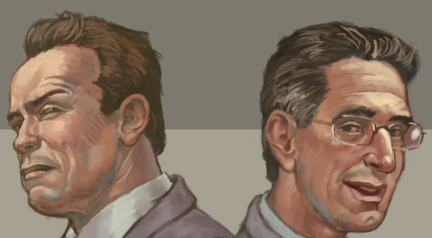
The second picture is a screen capture of how they look as I near the finish. I'm almost happy with the Angelides portrait, and Arnold is "close enough." At the beginning I thought that it might stray further into caricature, but I'm glad I stayed a bit straighter than I thought I could.

I'll post the final after it runs.


The End.

50!

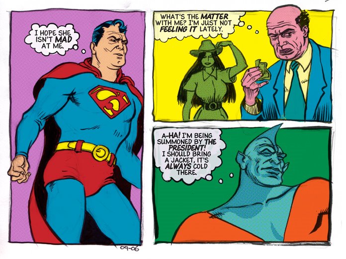
Post # 50, that is. My goal was to reach 100 this year, but that's looking like it might be a little out of range. Still, who'd'a thunk I'd make it to 50? Not I.

I've started a new job. I now work in the News Graphics department of the Contra Costa Times, and I'm still slightly dazzled by all the new routines I have to learn. Although it's technically the same type of job I had before, it requires a broader knowledge of more programs and operating systems, and the server set-up is more complicated than I'm used to. I know it's simply a matter of time until it becomes routine but I'm in "new-guy" mode, so my brain is slightly panicky.

The old job worked me extra hard right up until the end and the new one is really occupying my days and my thoughts here at the beginning, so I haven't had much time for personal work. And the commute! I'm losing one-and-a-half to two-hours to travel time, so far. That pretty much crushes what used to be my personal drawing time. I'll find a way to get it back eventually-- drawing on breaks, getting up an hour or so earlier, whatever.

Onward and upward, right? Onward, at least!

Today's post: Some quick doodles done late at night before I started the new job-- the only drawing I've done outside of work this past month. Pencil and pen on plain old paper. Colored in P-shop.

The End.

Couple of Quick Studies

A long time ago I bought that Dover book of Dore's illustrations for Don Quixote-- great book. I've given a rest for a couple of years but I picked it up again this week and went through it, page by page, not skipping a thing. And then I made a cup of tea and went through it again.

One morning, just before work, I did these figure studies from a couple of Dore's drawings. Pitt brush pen on paper, vandalized in photoshop to make them look fancier than they really are.

The End.

Goin' Sketchin'

I want to appologize for the word verification thing on the comments. I know it's a hassle but I received a flurry of ad postings that absolutely ruined my day. It hadn't been too bad before that-- one here, one there-- but enough's enough. There should be some way of correcting the problem (involving pain) for those who do the sending. That's all on that.

No, I'm not going out sketching today. I haven't done a self-portrait in a while, and I drew me the way that my "Jeff: Art-guy" action figure would probably look straight out of the box. That's a wide-brimmed hat hanging off the back of my neck. In the pouch would be a small pad of paper, a pen, a pencil, a pair of sunglasses that fit over the top of my regular glasses and about fifteen bucks for a burger and a couple of beers-- the best part of going out sketching.

My arms are not that long and I'm usually smiling. Other than that it's absolutely life-like.

The End.

Heads!

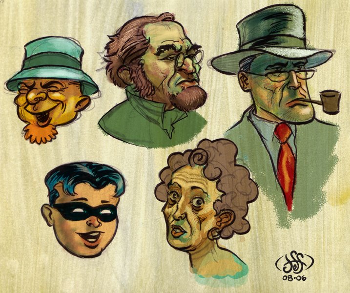
I have this box of crumpled folders and paper next to my desk at work and I've been contributing to this "archive" for a few years. Thumbnails for work projects, notes, phone numbers, bad sketches, good sketches and a lot more bad sketches.

I've gone through it and I can use some of it as a blog crutch-- drawings to scan and color and post for those times when I haven't the time/energy for making new stuff. Like today. Yeah, I can probably take the rest of the year off.

So, these heads are quick pencil and ink things I did at work. Idle moments, talking on the phone, waiting for stuff to print-- I've been pretty good about doing something for myself when I have down-time, and a big part of that is just keeping a pencil and piece of paper within reach. Colored in photoshop!

King of the Jungle

Have you ever read Edgar Rice Burroughs's "Tarzan of the Apes?" I am not as well-read in the area of early 20th century american pulp-fiction as I would like to be, but it's one of my favorite adventure stories.

Uh oh, I feel a long essay coming on and I don't have the time. So, forget it. Here's a cartoon of Tarzan and a monkey.

Ta daa!

The End.

The Lonely Ranger

Pencil drawing, scanned and stained with digital crayons.

The End

(p.s.: "Excerpt" is how that should be spelled there in the picture. No spell check when you're using a danged pencil!)

Cindy and the Hummingbird of Mystery!

I've been pretty busy of late and done very little after-work art. This is a little something I whipped up the other day. It's one of those "unfinished and probably never will be" pieces.


Most likely I'll work on it some more (because I have this idea for a different background!) but it is just a doodle, after all, and that was what I started this whole blog thing for in the first place. Doodle public storage. I'll update it later. Probably.

Quick(ish) Painting

Started this last night after I got home from work and I woke up this morning with the notion of finishing it. After about a half hour of fiddling I decided that it was done, because I was starting to fix things. No fixing, says I. Paint; finish; go on to the next!

That's my outlook today, at any rate.

Just embrace that weird perspective and go on with your life. It's really bugging me. I may delete this if I just can't take it!

The End.

One of the James Gang

I may have mentioned this before but I was never a "western" kind of guy. I don't think I'd even seen a western movie until "Silverado" came out, and I didn't see any after that until "Unforgiven." But a couple years ago I started listening to the "Gunsmoke" radio shows (broadcast in the 50's-- before the T.V. show came on) and I picked up a couple of Moebius' translated-to-english "Blueberry" comics. "Gunsmoke" is now just about my all time favorite radio show, and Moebius' "Ballad for a Coffin" is one of my favorite comics EVER!

Since then I've been on a western spree. Louis L'Amour, Spaghetti westerns, other radio shows... can't get enough.

And, of course, I'd like to make some western doodles that look like I know what I'm doing. I've been studying books about the old west, gunfighters and trains in an attempt to reach a certain level of visual knowledge with the hope that I can create a few decent images of my own.

So far the stuff I come up with on my own looks pretty crummy. Every time I draw a bad western picture out of my head, I force myself to do 10 push ups and then draw something from reference. This way, someday, I will be a truly mighty western artist. Or, more likely, my arms will be too tired for me to draw anything.

This is my tired-arms western drawing for today. I will not show the really bad one I did before this.

The End

A Page of Stuff

Okay. It's hot. I've soaked a t-shirt under the faucet and put it on. I've turned on the fan and as I scribble I fight the wind for control of the piece of paper. I'm flipping through a book about the old American west and drawing a couple of figures from the old photos. The wind pushes those pages around, too. I give up and draw from my head.

I carry the wind-bent and water-wrinkly paper down to the scanner. I scan. I start to color. Maggie, the most dignified of cats, walks around making a horrid gagging sound before producing the most amazing of hair balls. A true masterpiece. I pause from coloring and perform the hair ball ritual. I finish coloring. About 35 minutes to color and hair ball.

The End.

I missed posting a couple of times. . .

So I settled down under this tree, you see. There was a gentle breeze and I was a little sleepy. I thought, "why not take a little nap?" Certainly no one would miss me if I were to take the afternoon off...


I awoke with a start and my beard was down to here! But, I thought, I just shaved! I ran across the field, back to my house to find a skyscraper! My neighborhood had been destroyed, said a passerby, by the Canadians when they attacked and took over the U.S. (so they could be closer to all the hockey teams that moved here.)

Oh, gosh, I thought. My blog! I haven't put up a new sketch or anything since I took that nap! I hope they still remember me!

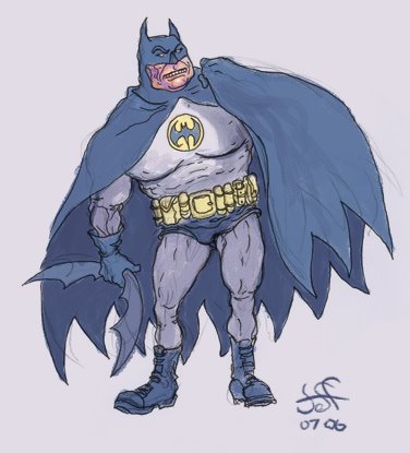
The Batman: Grubby little sketch off to the side as I worked through the day. Colored in p-shoppe.

Emily Sargent: Found a Sargent pic, blocked in the basic shapes, threw away my reference and then over-worked it to the point of blah-ness. P-shop.

The End.

Thursday


There is no story for this, you can make your own. Done entirely in photoshop.

The end!

Tuesday!

My drawing today is a single panel. A simple snapshot, you might say.

It is based on an incident I witnessed while waiting in line at a donut shop. The man who made the mistake was a tiny little guy with a pronounced squint and the victim was a very tall man who was wearing a bright orange blazer and vivid yellow shirt. They both passed off the incident with an uncomfortable solemnity.

Drawn with a stubby pencil and colored with ye olde photoshoppe!

The End

Monday's Sketch

As I glance over what I've done lately-- this one included-- I see I've been doing a lot of free-standing characters. I'll try to ground them somewhere, or put them in a relationship with something that might be in an environment. It's kind of lazy, drawing people afloat in space. I may not have time for much more than that so don't hold me to it.

This is just some lady. There is a string tied around her leg to remind me that she should be wearing a holster. I sort of forgot about it until I was finishing up the coloring in photoshop. Just imagine there is a holster with a really cool-looking pistol handle sticking out of it. Thanks.

The End.

More Character Doodles

A couple years ago, I started working on a comic-- not a professional gig but a personal project-- the two on the left are new drawings of main characters and the two on the right were background characters I felt like revisiting.


You don't have to read this next bit, I'm just rambling on today:

I've always loved comics-- I've been drawing since I ate my first crayon, and the first artists' names I learned were Kirby and Ditko and Buscema-- but I've never done more than dabble with comics. Thus far, my career as a picture-maker has taken me in a different direction but every once in a while I am inspired to increase my level of dabbling to enthusiastic dabbling.

On this occasion of comics-making-- a slow-moving slice-of-life drama about artists attending an adult school figure-study class-- I was pretty good at it for a couple of months. I'd work for an hour or so in the morning before my job and I'd try to get in a couple hours after.

My weekly process ran like this: The first day I'd write a page in the morning, arranging the lettering and layout in illustrator; I'd do quick thumbnail sketches at work during slow times-- just rough figures and scribbly environments; and then I'd work on the final art from then on out, adding color as I could. Thumbs, layouts, final drawings, lettering and colors-- all done at home on the iMac. I'd post the new page on Sunday nights, and I don't think anybody ever saw it. That's okay, I was doing it for me.

I stopped working on it when I took on a long-term freelance job. And then I focused on working on pieces that might help me get a new job. And then, other things intervened. Etc. So, when I finally got back to a point where I wanted to work on it some more, I saw it with that fresh eye; you know the one-- the one that can't stand looking at your old stuff. So here I sit, my enthusiasm blunted by too long of a vacation.

Why am I unhappy with it? I mentioned before how I'm trying to break away from doing art entirely on the computer. I've worked that way for a few years because I felt I needed to know how to do it, and now that I have a grasp on it, I'm trying to settle comfortably somewhere between the pencil and the pixel. Going back to look at this comic I can see where being strapped to a 4x5 Wacom tablet has hurt my drawing. Maybe I was used to what I was seeing on the screen but now, after having once again taken to paper and pen, I feel that I can draw better than I was drawing with the Wacom.

(Here is a sample of one of the less embarrassing pages.)


Maybe if I had a larger tablet I would be happier with the act of drawing-- If I could move my whole arm around as opposed to just wiggling the fingers and wrist I might get more of that "real drawing" feel-- but I can't afford that kind of experiment at the moment. At any rate, since I've been doing more drawing on paper I am more content with the finished work. I think my art has improved and now I have drawings that I'm collecting in sketchbooks instead of on hard drives. Well, they're collecting there, too, but you know what I mean.

I don't know if I'd revisit this abandoned project-- I'm afraid I'd have to re-draw the first twelve pages before I'd show them in public-- but looking around at all the fine work other artists are doing I'm on the brink of being inspired, once again, to try something along these lines.

Maybe.

The End.

Work-In-Progress

This is part of an illustration I'm doing for work and it's scheduled to run a week from today.

For my cartoony-er stuff I really like to pour on the garish colors. When I have these weird and ugly types of characters I feel it adds to the fun if they have green skin and orange pants and purple hair. I make every effort to control the color in most of my work, but for the wackey-fun stuff I try to ignore it if my color-sense is tingling.

One of the hazards of my occupation-- illustrator and graphics guy for a newspaper chain-- is the printing process itself. Everything I do runs in several newspapers and is printed off of-- I think-- three different presses. During a print run quality varies. As ink runs low it is replaced on the go; so, for example, you will see some copies are running low on magenta and the colors seem dry and rusty, then, when the ink is refilled you will find vivid or over-saturated copies. This can happen with ALL the colors so there are many interesting variations to be had.

And then there is the registration of color plates. One of our presses in particular, as I understand, is very old and there is a good deal of off-register printing coming out of that one.

To top it all off newspapers are printed on newsprint! Considering all these factors I've come to regard each copy as a monoprint of sorts. Unique! One of a kind!

So the point of all that was to say that I've found, by using a reckless palette, no matter how dried out or oversaturated or off-register an illustration happens to print, it retains it's characteristic madness on the page even if it comes out much differently than I'd hoped for.

The End.

Jam Dude

I have obviously run into some kind of a wall these past couple weeks. I've been busy, but should have been able to get something new together. Nope. Here's an old thing.


This is a doodle-painting I did a couple years ago for my deceased blog.

Something new this week! Maybe for sure.

Too Lazy Today

I've drawn a few things this week, but I just don't feel like scanning. Later. So, in the interest of making it look like I'm on the ball, here are a couple acrylic things I found on an old zip disc. I'm guessing they are about 10 years old, but they might be slightly younger than that.


Sorry they're so small. I recall these were on my very first website (AOL homepage thingie) way back when. I made all the artwork very tiny because it would take a loooong time to upload back in the days of the 16k (or whatever) dial-up modem.

I'm pretty sure they were drawn from some American Heritage books I picked up at a library sale.

The End.

Saturn's Seven Vipers


*Accidentally deleted this 2006 post while tidying-up the blog. Trying to restore it to its old spot, but lost the comments. Dang.

I felt so bad about my previous post that I thought I'd try to make up for it by showing an even-older old thing. This might have been my first attempt at doing one of those faux sci-fi covers I like to mess around with. I set out to create a space-heroine with the body of a Peter Paul Rubens-Girl -- I probably got carried away in a place (or two) there, but I don't think it violates the overall intention.


I was still new to the whole digital painting thing and I obviously loved being able to zoom way in and work on tiny little details. I've attached a close-up of her helmet where I wasted some time with this new power; If I had considered that the distance from the top of her helmet to her chin is less than an inch print size, I probably wouldn't have fiddled around so much with it.

Eating Contest!

I've been busy this week, so I offer up this slightly old scribble I did for work. It ran in black in white so this is it's color debut!
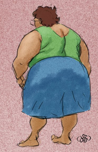
As I recall, this accompanied a light-hearted opinion piece lampooning the "eating contest" as a symbol of the decadence of western culture when the rest of the world is starving blah blah blah.

All I know is it makes me hungry to look this.

Sorry for the gross little cartoon– I have a couple of new things to show, but I haven't scanned & colored them yet. Soon! Again. Sorry.

The End.

Quick Doodle

Done with pencil and pitts and then stained funny colors in photoshop.


That is all.

Vader's Day

For my job, I'm working on a graphic presentation for Father's Day, and to make a long story very short, this sketch is not it.


During the brainstorming session it was mentioned that perhaps it would be good just to take one "father figure" from the story and make him the main art. Well, the text is a series of pieces by several staff writers about fathers, real and fictional, in various entertainment mediums. That's a lot of writers and that's a lot of fathers. To pick out Vader as the big representative won't really work. The tone and subtopics change too much to house them in a big, goofy, humorous MAD magazine style graphic.

But, I doodled this rough idea just for kicks and inked and colored it while I worked on the real assignment.

Anyway, not to make a big deal out of; it is merely a simple cartoon-- not even well designed. I just wanted to show it to somebody. Here you go!

The End.

Digital Dining

A fun cartooning assignment I had at work last week.

For this illustration I sketched the characters in pencil and roughed out the design on typing paper. I'm trying to cut down on the amount of time I sit in front of the computer when I do my illustrations-- I've been working only with the computer for the past few years. The deadline pressures of the newspaper call for things to be done quickly and I've used photoshop as my tool to the exclusion of all other methods of picture-making. Chronic shoulder pain and a sort of creative-claustrophobia have driven me back in the other direction.

I really enjoyed drawing these characters, each of them on their own legal-sized sheet of paper with a blunt, dark pencil. Of course, I scanned them in, arranged them just so, redrew most of it-- sort of "inking" the original drawings on another layer-- and then added the color. Still, it was a fast process and I'm going to work this way more often. I'm aware that it's not even close to breaking with digital art but it is about as far as I can go right now.

p.s. Forgot mention that this was for a story about technology and food. Now you can look up recipes with your cell phone while you're shopping-- there was more to it than that, but that's all there was to my drawing.

Online Romance

Pen and ink drawing. Really! I obviously referenced that famous Charles Dana Gibson image.

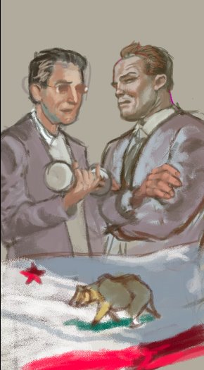
Well, to confess, I drew each character on their own sheet of paper and then drew two computers on their own pieces of paper. After that I arranged them after scanning them and did a little touch up here and there. So, it's ALMOST a real pen and ink drawing.

This is-- I think-- the 4th online romance illustration I've done in the past few years for the paper. It must be a hot topic.

The end.

Venus Needs Men!

This is the game for which I created art! It's not available yet, but as I understand, it will be shipping this month. You can visit the website at www.venusneedsmen.com and take a look at what it's about. I thought I'd show the box art here and a few of the roughs I did along the way.


The game seems to have a light-hearted, "pulpy" feel and during my initial communications with game-designer John Velonis I really got the feeling that this was going to be a lot of fun. And it was!

As I recall this was the progression of the main art's design, more or less. I didn't do a bit of it on paper, it was photoshop all the way through. That's also true of the many black and white cards, a few of which were seen in the previous entry.


These are just a few of the unused scraps that I found in the reject folder.


To prepare for this project I looked at a bunch of old sci-fi art and EC comics, just soaking in the pulpy goodness until my eyes could see the world only through Wally Wood colored glasses.

It was great fun and I hope it shows.

The End.

Game Art

Here are a few drawings I've done for a board game. Full story on that very soon: