New Years Illustration Part 3 of 3

Here is the final, as seen in your Bay Area News Group newspaper on the 28th of December (2009.) I pulled a switch on the chair dancing character, turning him into a her. I don't know why-- maybe I was gender-matching the writer, Jessica Yadegaran. I didn't do that as a conscious decision, but I have done that in the past.

Here is Jessica's excellent story. (Link has expired)

After "inking" the rough in Illustrator, I took it back into Photoshop and colored it. The inverted cat I sketched in at the last moment, just because the spot looked bare. Both cats were inspired by my two feline pals, Mr. Riggs (23 lbs., fond of resting on the ottoman) and Quincy (20 lbs., often found in the lower-most pose.) 

Looks like my post-count dipped a bit this year. That's disappointing but understandable. I've taken on a second job, and the time available for creating artwork for myself has been crushed. I do hope to fix that in the months ahead.

*     *     *     *

So long 2009, you malodorous wretch. Hello 2010, take off your shoes and make yourself comfortable. Here's a cup of coffee and a donut. There, isn't that nice? Let's just relax for a year. I'll put some Jelly Roll Morton on the Victrola/iPod and you can kick back in that soft chair and read some comics. There. This is how it should be. No sudden movements, please don't touch anything, and we'll get along just fine.

The End
*

New Year Illustration Part 2 of 3

As I mentioned in the previous post, this illustration pertains to a story about avoiding the crowd scene for New Year's Eve. The rough I posted was a painting done very quickly in Photoshop. It was an effort to nail down shape and content, and I didn't stray from that first brainstorm as I pressed on, as seen in these two examples.


...I switched from a Photoshop-painting to Illustrator-inked drawing to make this a cleaner, easier to read cartoon-style presentation. I tend to go light and fluffy and easily digestible for my newspaper work-- it seems to go over better and I don't have to worry too much about perplexing the readers. I also prefer not to distract overmuch from the text, as a consideration for the writers.

...I don't want to give the writer anything to worry about when I work with them. I understand it could be jarring to have a hideous cartoon or painting sitting next to your carefully crafted story.

To Be Continued...
...

New Year Illustration Part 1 of 3

Here's the rough for an illustration I'm doing for work. The story will say, "Hey, it's okay to stay home for New Years Eve. You don't have to get dressed up, get drunk and kiss other drunk people you don't know!" Although that sounds like it could be fun. But the idea is, "You can stay home and have a good time, too!"

Alas, my New Years Eves look more like this illustration, only without the festivities. Actually, I'm usually 10 winks into the needed 40 by the time the old year fizzles and the new one pops. It's been so long since I was awake for the changing of the year that I've forgotten what it looks like.

Maybe this year. Looks like it could be fun!

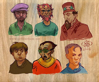
Blah. Heads Again.

As I keep mentioning, I've been too busy to draw. It's been MONTHS since I've done anything of substance for myself. I doodled a few heads in October, scanned them, and they've been rotting on my desktop ever since. Once in a great while I took a moment to stain one with color, but only tonight did I completely fill them in.

I was going to write a short blurb for each head, perhaps inventing a name and brief history for each of these fellows, but it might be months before I'd finish that chore. So, here they are. Such as they are.

Pencil, pen, ink, photoshop!
.

Sad Holiday, Part Two

Here's the finished version of Monday's post. I've had a terribly busy week; a week chock-full of misadventure, misfortune, anxiety and calamity. Due to these troubles I missed a couple of days at work and had very little time to complete this project.
...Fortunately, my deadline had a little wiggle room and I was able to get a few hours at the very end with which to tidy this up and make it presentable. It's not nearly what I had been hoping for in terms of craftsmanship, but-- to be honest-- that rarely is possible in my profession anyway.
...Jeez, am I whining today? I think this picture is making me sad.
...Created in Photoshop, with a touch of Illustrator for the patterns on a couple of the colorful papers the characters are set upon.

...
The End 
...

Sad Holiday, Part One

Here's my preliminary doodle for an illustration that will run on Wednesday. It is to accompany a story by Most Excellent writer Laura Casey about dealing with grief and loss over the holidays.
...For the initial concept, I thought "A collection of presents, all of them opened except for one." That seemed like a sorrowful idea to me. In order to inject a little more information and empathy into the thing I decided to use toys as the gifts, and have the gifts themselves emote and gather around the one unopened package.
...It probably won't be easy to read on its own, but buttressed by the story I think it might be pretty effective. Doodled in Photoshop!
...Final tomorrow!
...
To Be Continued...
...


L.L.A.P.

Here's a Preview cover I whipped up for work a couple of weeks ago.
...There were plenty of photos for the event, but they weren't quite right. I took a picture of my hand and did a quick trace/draw. I did a fairly careful painting of my hand and progressed about 1/5 of the way with that; then I decided it was ugly and opted to go with a more graphic treatment.
...I ran that crappy cutout filter on the original picture of my hand and used that as reference to paint from.
...There wasn't much time for this project and I responded to some quick art-direction by email over a weekend. Artist and page designer Jennifer Modenessi dropped in the text and made it look better than I thought it would.

Drawn in P-shop!

The End!
...

What the...?

Again, it has been a long time since I've posted. Busy with my job, busy with my other job, busy with chores and busy with visitations.
...Here I am, trying to start this up again. Alas, I haven't done anything new except for a small collection of head drawings (surprise), but here's something a little different.


This is... well, I have to idea what this is. I did it-- years ago-- I kinda remember it, but I couldn't tell you why. It has to be one of my first digital paintings. There is a very transparent glazing building up of color and layers; something I was fascinated with when I began drawing on the computer. I don't see any textured brushes used here either, so this was done before that discovery, as well.
...No point to it, I'm guessing. It was probably just an exercise in painting with photoshop, back when it was new and exciting!

THE END!
.

Art Slump

Yup. Art-slump. What can you do?
...First, you have to realize that you're in one. Done. It's been over a month since I've worked on anything not job-related. No drawing, no painting. It's not easy to recognize that the slump has smothered you.
...Keeping a sketchbook, or a blog can help. For example, today -- as I boarded the internet for more job-related activity -- my blog appeared in the window. Oh look, I thought, I haven't drawn anything since early September-- and that was a pitiful little doodle. Crap. I should do something. Perhaps another pitiful little doodle.
...I created a photoshop document, and stared at that for a second. What am I going to do? I'm too busy to do this.
...It is dim outside. The early morning in the shadow of Mission Peak is cool and gray, the sun will not bite the tops of the trees for another half-hour. Across the street walks someone wrapped up in a thick coat and heavy pants. He has a backpack that hangs off his back and a gigantic shoulder bag. He appears to be delivering papers-- they don't deliver them that way anymore, do they?
...I sketch him quickly, but he is gone before I figure out how to draw the shoulder bag. Quick color job. Ta daa.
...Now, I can begin a new art-slump.
The End
...

Another Preview Cover

Did a pretty quick cover for the entertainment tab this week.  I spent about 20-30 minutes on the rough and about 45 minutes doing the final drawing and color job. I spent a few hours trying more stuff-- other ideas and treatments, before deciding that I didn't need to do anything else. That's the way it goes sometimes.
Photoshop & Illustrator.


 Here's the rough. I thought about using this as is, but it didn't quite feel right to me at the time. Kind of like it now! Oh, well. I did leave the "pencil drawing" in the final-- turned it to a light red and faded it. I like to see a little of the rough stuff in the finals. It humanizes it, keeps it from looking too slick.
The End.
.

Rude Illustration

Here's an illustration for a story about civility; or, rather, the lack of civility as demonstrated by a few public figures in recent weeks. It'll run this Wednesday. This job was a pretty quick turnaround-- less than a shift of working time, I'd guess.
...Although I work at a newspaper I try to avoid "entertainment" and "politics" beyond what is inflicted upon me during the course of the working day, so I'd never heard of either of these clowns until they made jerks of themselves.
... I would have inserted Serena and Jordan (now them I know!) but there wasn't enough time...
Created in Photoshop!
The End.
.

Rough Characters

Don't know what it is, but I get the feeling either of these guys would stomp your toes and not feel bad about it all.


Quick little head drawings, committed with pencils & P-shop.

The End
.

Junk.

Not very happy with any of these doodles. But they're all I've done this week.

Pencil & digital color.

The End
.

Armistice Day, 2006

I found this in a folder at work. I have no recollection. The file creation date was Armistice Day, 2006.


It has nothing to do with Armistice Day. Digitally drawn.
The End
.

Heads & More!

Still no real work; still too busy. But, here are a couple of heads drawn with pencil and smothered in Photoshop.

And, for the kids, here's a not-very-good Spider-Man:


Pencil & pen on paper & photoshopped.

The End
.

Cartoons for Work!

I've been constructing a graphic at work for a feature on what it takes to get ready for college -- starting in the 8th grade! I sure could have used a similar list of clues when I was in junior high-- not that I would have had the sense to take them to heart
.
 .
These are simple illustrative accompaniments for items on a very long list; they're scattered around the graphic where appropriate.
.
. 
These started as pencil sketches which I inked and colored in Illustrator. That is not my usual way of working but there was talk of the online department creating a flash version of the graphic and I thought it might be easier for them to work with Illustrator files. It sounds like they're not using the illustrations though. Oh well.
. 
 .
That's all right. I'm a little burnt out on looking at similarly slick computer cartooning, but this approach is appropriate for the presentation.
. 
 
.
The End
.

Smoking

Here is a doodle that happened on a piece of paper tonight at work. I feel like I've seen this guy before. I hope I didn't steal him from somewhere.

Took him home and colored him up. He is smoking. Don't smoke if you can help it.

Some Heads

More baby-steps toward doing some real work. These are little heads I scribbled on a piece of paper last week. Tonight, I sat in front of the old iMac, listening to BBC radio drama via internet (the Barchester Chronicles), and painted up these here homely sketches.
Pencil, smothered in Photoshop!
The End.

First Step to Recovery

I'm trying to get back into the ArtBlog habit. This probably doesn't count.
I drew these heads back in January. I scanned the page in June. I colored the top two heads in July. The rest I colored just now. It counts as a post, certainly, but I don't think it counts as new work. I'm not sure. Is there a rule book for this?
Pencil, pen & Photoshop!
The End.
.

Quick & Feeble Post

After a long and horribly busy stretch I have this!

This -- and that lame scribble in the previous post -- is all I have accomplished in the past month or two.
...Look! See! One hastily crafted sketch, which I then-- with similar haste-- colored in Photoshop.
...There is no point. He is simply a ridiculous, aimless doodle. I felt I had to give him a pistol so he might be taken seriously.
...I foresee spare time in the weeks ahead and I'm hoping I can remember how to draw. If so, I will share.

...Pencil and brush pen on inexpensive Japanese calligraphy paper-- the kind whereupon, with each stroke of the pen, the ink spreads out in willy-nilly fashion!
...
The End
...

Daydreams of Rubens

It has been a looong time since I made an appearance here. I have been-- as the saying goes-- very busy.

The workload at my place of employment has been exceptionally demanding and sadly vexing of late; and I've taken on a second job, which is thoroughly enjoyable, but it is close to being a full-time job as well. I don't mean to be mysterious, but more on that in a later post, if I ever get around to posting regularly again.

This drawing is my first spare-time drawing in a month. I was thinking about Rubens, and those grand compositions of bulky, writhing bodies and shapes. Not quite bulky enough but I think my intentions come through! Jacked up left hand though.

Pencil, pen and photoshoppery.

Those Crazy Kids

This illustration accompanied a story by Contra Costa Times writer Jackie Burrell about "sexting." Sexting is catching on with the teen and tween crowds and Jackie's story discusses this trend and some of the potential repurcussions. It's one of those sensitive topics that makes me flinch.

I don't mind sensitive topics. It's professionally satisfying to come up with (hopefully) tasteful ways of illustrating things that most people don't want to see illustrated. Sometimes though, the subject can seem too fraught with perils impolitic, or it is a topic that is a personal turn-off.

Well, when this assignment was pitched I tried to look like I hadn't been listening. Hm? What? Oh, yeah, well, I think... just a sec, I have to run out to my car. Etc.

I didn't have to squirm overmuch because Chuck Todd -- King of the Graphics Department and all around stand-up guy -- said that he had a few ideas for an illustration and would be happy to do it. Whew.

Time passed, I gave it no more thought. Not my assignment, not my problem. And then, one day, there was a workload siege. The department was attacked from all sides by brutish assignments and marauding chores. At the wrong time I slew a rogue project and paused to wipe my brow and clean my blade; for that briefest of moments it appeared I was not doing anything. So, Chuck Todd -- King of the Graphics Department and artful dodger -- turned to me and said "I have no time for this! Here! This is my idea! Quick, man! The deadline, she approaches with shredding claws and tearing teeth!" Or something like that.

I took a quick picture of his thumbnail with the iMac-cam
and made my drawing using Photoshop!

the end
.

Surrounded By Cows

This is an illustration for a collection of stories from our readers about bad camping experiences. One of the readers' submissions told about sleeping out under the stars in a field, and upon awakening in the morning they found themselves surrounded by cows! I think that's a great title for an adventure story.


I'm not happy with the composition on this one. It's not well-designed and there are several awkward overlaps in there that flatten it out. Bleh.

As an excuse I offer there was not much time to work on this, although such simple illustrative concepts should be second nature by now. Ah, well. Here is the original quick sketch: (Don't blother clicking on it, it doesn't get any bigger...)


I doodled it quickly on paper and then held it up to the camera on the iMac, and then drew on top of that in Photoshop!

THE END!
.

I'm back...

This is an editorial illustration that ran in Sunday's Contra Costa Times and several other MediaNews newspapers. Drawn in Photoshop!

The column -- by Brewster Kahle for the Washington Post -- considers the potential outcome and effects of an impending ruling in a lawsuit filed by authors and publishers against Google. Google has undertaken a book-scanning project that appears to be stomping all over the toes of copyright laws, and its possible they will make money off of some books and have total control over works that, by law, are not theirs. Google's really getting on my nerves lately.

This is my quick and simple concept for this illustration. My original idea for the "Google-key" was to replicate thier logo with one, long piece of iron bent into that shape. I had only a couple of hours to work on this so it was a compromise for completion. The drawing is alright, I guess-- I had fun drawing the book!

* * * * *

Sorry it's been so long since I've posted -- I hope someone is still out there looking at this once in a while. I've been exceptionally busy at work and pretty burned out by the time I get home; I'm really hating most of my "computer-time" lately. Hopefully, it's just a phase.

I have another silly little illustration to show (I'll probably blog that tomorrow) and I have a personal project in the works that I'm enjoying, so I think I can find some more enthusiasm and pick up the pace around these parts. Stay tuned.

The End
.

Goofing Around

A loose doodle. I wanted to practice freestyle landscape Bob Ross style. No reference, that might be why it's not very good.

Well, I did look at a few pictures after it was almost done, searching for some clues on how improve it. I found a little bit of help and started to "fix" it, but I could be here all day doing that. Good 'nuff for the doodleblog.


The ENd

Bad Fan Art

I'm going to design the Preview cover at work next week-- that's the weekly entertainment/movie/TV tabloid. Cover story: that Wolverine movie. Not too sure what I'm going to do, but while I thought about it I doodled up a study referencing one of the promo photos.

I set out to do a quick study, pretending I was Frazetta, but I may have taken the rendering too far in places and it's starting to look a little too precious. I stopped before I made it worse.

It would be cool to do a faux movie poster along these lines, but there won't be time for that. I'm leaning toward not using this for the cover, because it doesn't really add anything to the original photo (and I'm embarrassed by that poorly done arm) but I thought it might be okay for show-and-tell here. I haven't painted anything in a long time, so it was fun.

I really want to put him in that brown and orange costume that John Byrne designed, mask and all; and then cover his arms, shoulders and chest with the copius body hair he had back in the day.

Hopefully, someday, they'll make a cgi X-Men movie with the characters designed to look exactly like the Byrne and Austin X-Men. The comic geek in me would think that would be ultimate super-hero movie bliss.

The End.
.

Twitter 2

Here is an illustration for a Chuck Barney story; another contribution to the Twitter frenzy. In particular it is a story about celebrity twittery, which is a rather robust topic at the moment. Our story has been on the burner for well over a month but it hasn't made it into the mix until now, so it might not be as cutting edge as it could be but sometimes the crumbling of the cookie happens in this way.

I did another Twitter illustration last year (here) and I toyed with the idea of doing this one in the same style (a sort of cartoony cubism, if you don't feel like clicking the link), but it had been a challenging project. The amount of effort may not show in the final product but I took an improvisational approach to it and there was a lot of searching and erasing to do before I came to the happy end (I really enjoyed that one.)

When I found an afternoon to spend on this illustration I decided to do it in Illustrator. Why? I don't know, I don't really care much for Illustrator as a drawing tool. I haven't worked with it enough to be able to impose my will on it. I feel like I spend most of my time trying to figure out how to undo what I just did on accident; but I wanted to achieve the flavor of Twitter's design style and I decided that could be done more easily with vector art, and I had time to wrestle with it. So what the heck1

I kept it simple, mostly just circles and ovals. It took a while to create a bird that looked like a bird but once I got there it was pretty easy. It was just like moving little cutouts around on a table. I did several layouts and gave the page designer 3 or 4 options to work with. This is the one that made it.

I didn't have the word balloons around the photographs at first, so it kind of looked like the big bird was vomiting celebrity photographs onto the smaller birds. Not a totally inappropriate visual interpretation, but probably too obvious to be subtly funny.

In another display of obviousness, I turned the eye of the large bird to a star to set it apart as the celebrity, leaving the other birds with simple dots for eyes.  I remember reading something about a simple dot being used as a symbol for the common man. Was is Dostoyevsky? Nietzsche? I know that Woody Allen used that symbolism in "Crimes and Misdemeanors," but I forget where it originated. (A quick google didn't give me an easy answer-- that's all the research I'm up for at the moment.) Anyway, it works as a good incidental but probably unimportant use of symbolism, adding a deeper, pretentious layer of meaning to what seems, at first, a rather pedestrian composition. I'm reaching, I know.

So, here's the latest thing. It does not look like something that I would do, which I take as a sure sign I'm not in control of the tools I'm using.

The End.

Yawn. More Heads.

Here are a few more head doodles. I think I'm really digging on the top-left's hairstyle/beardstyle, so much so that I've drawn it twice now (see yesterday's post.) Maybe I'll hide the razor for a few months and see if I can get that look going in the real world. It'll be a big hit with all the cool kids, for sure!

I've had a very busy Jan-April, and although I've managed to throw a few little drawings and works up on this blog, I'm determined to do some work with a bit more meat to it. Heads are fun but they don't really do much, do they? I'll see about cranking out some full-figure stuff and maybe even some backgrounds. You know, real drawing-- not this weak doodleshtuff I've been tossing around. S'fun tho.

Pencil, brush and P-shop colors!

The End.
.

More

Here are a few drawings scribbled in Illustrator and colored in Photoshop.

Crust Prevention

There is not much time for talk, as I am about to run off to work, but I had to throw something new up here. April has been very busy and I haven't found the time for drawing. I'm taking this moment to stir the stagnant waters of the puddle that is this blog, just to keep the crust from forming around the edges.

Here are a few heads. They're not very good. They're all I've got to show. More soon. I hope.

THE END

Surfing Thing

This is a graphic that ran in the San Mateo County Times last week. I worked with reporter Julia Scott (always a pleasure) who wrote the text and a related story. This is more of a narrative graphic than most I work on, and these are a lot of fun to put together. Newspaper graphics routinely require the utmost speed but it was held for a couple of days, giving me the opportunity for extra craftsmanship.

This isn't the final version-- there were a couple of tweaks and corrections to the text, as I understand it-- but this is the only copy I have with me right now. Close enough!

THE END
.

Just Heads Today

Here is a quick flurry of heads. Drawn with a RoseArt X500 0.7mm mechanical pencil on paper, scanned with a Mustek Scan Express A3 1200 Pro USB Large Format Scanner and colored with Adobe Photoshop.


The End.

There's One In Every Crowd

This is the final version of the drawing that will be running Sunday on the A&E section front-- I previewed a few heads in a previous post with different coloring. Click the picture for a big ol' version. Yow. I should scale that down. Eh, too much work.
I began work on this, as usual, by roughing in shapes in Photoshop. Wanting a very clean look, I took those roughs into Illustrator to "ink" them. Then I dragged the characters back into photoshop to arrange them and to color them.
...Other work obligations appeared and demanded my attention, and I knew I was not going to make it if I didn't start cutting corners, so the final few characters I drew quickly in photoshop and simply left them there, tightening them up as best I could.
...There were a few unfinished and unresolved design problems at the very end, but what can you do? The harried, final push was spent smooshing things around and coloring in the awkward spots in an attempt to make it look like it was all planned that way.
...It would have been great if I could have done a couple of more rows on top and to the side-- eh, but that's just because drawing the characters was so much fun.

THE END
.

Newspaper Illo That Didn't Make It

This illustration was set to run front page on the Sunday that just passed, March 22, but breaking news took top priority, and rightly so. Four Oakland police officers were killed in the line of duty of Saturday night, and there's not much to say about such a horror.

Since it probably won't be used in the paper any time soon, I thought I'd share this here. Scroll down a couple posts to see my first rough for this.

The End.

200!

(To be read aloud, preferably in a style reminiscent of Charlton Heston or William Shatner; dramatic but with a hint of ham...)

The great event is over and the crowds are melting out of the stadium, flowing in streams to the parking lot, swirling in eddies of automobiles and escaping into the currents of freeways, expressways, boulevards and roads. Eventually, in tiny groups, they coagulate in their homes and for a long time they will carry with them the glow and the specialness of what they witnessed. Every once in a while someone will say: "That was quite the thing to see, wasn't it?" They will nod and smile and remember the glories.
...Back at the stadium, up in the stands, the clean-up crew has finished. They sit on the aluminum benches, they lean on the iron railings, they light cigarettes and they talk about the things that are important to them. One of them stops in the middle of a sentence, squints and with a baffled expression quietly says: "Whut the Hell?" He points down to the field..
...And there, running on the oval racetrack-- not loping gracefully but moving forward awkwardly, pounding the ground with his heavy boots-- is a solitary figure. He does not belong there on the track, and it's more than the boots that give him away. He is not outfitted in current fashion but rather in an outdated manner that he thinks is the current fashion. His socks are pulled up to the knee. His shorts are cut too high and his legs are not the legs of someone accustomed to running. Without consideration for aerodynamics his legs and arms are brazenly left unshaven. You can hear his keys jingling in his pocket.
...The clean-up crew watches silently as the man rounds the final bend, weaving in and out of the outside lane as he does so. He breathes heavily-- frighteningly heavily-- and each breath is accentuated by a vocalization that is part moan and wheeze and gasp. He is damp with sweat and it is the greasy kind of sweat laden with the oils of too many croissants, too many pizzas; it beads and clings to him as though he is basted with exotic butters.
...The runner gulps and groans and thumps down the final stretch. Excitement grows in his breast and he thinks "Turn it on! Time for the final burst of speed!" His arms begin to swing in wider arcs, his breathing sounds increase and become falsetto shrieks, his knees rise higher and pump faster... but for all the show his speed stays about the same.
...Time passes, and finally he crosses over the faded, trampled chalk of the finish line. He staggers and he stumbles to a wobbly but standing halt. He tries to jump and throw his arms up in celebration but he almost falls. He bends over, hands on knees, eyes shut, he is praying for the pain to go away.
..."Hey," say one of the janitors. "Hey, you! You're not supposed to be down there!"
...The runner sees the people in the stands, but the rapid heartbeat pummels his eardrums from the inside and drowns out their cheers. He points at them and whoops and does a little victory dance that gives the impression one of his legs is much shorter than the other. "Whoo!" He yells. "Whoo! 200, baby! 200!"
..."What'd he say?" asks one. "Fukif I know," says another. "Hey! What are doing? I'm going to call the cops if you don't get the Hell out of here!"
..."YES!" the runner enthusiastically declares, triumphantly accepting the adulation of his fans. "200 blog posts! 200! YES!"
...One of the fans pulls out a cell phone and starts dialing.

The End
.
.
Okay, that was fun. Here's the drawing for this post, since drawing is what this is all supposed to be about. It has nothing to do with the story, but here it is anyway.
Pencil, pen and Phtotshop. Photoshop.
200 posts! Whoo!

Little Something

This is the first draft of an illustration for my job. It's been a tough few days-- busy at work and busy at home. I'm suffering from a sense of work burn-out and I have a fierce headache. I feel a day-long nap coming on which I'll try to stall until the weekend-- so this picture has unintentional self-portrait overtones. Undertones. Or something.

Okay, enough distraction. Back to work.

Cartoon Heads!

Here are some silly heads. I'm making them for an illustration for work. The project involves a crowd scene so I've got to come up with a small slew of faces; I pulled a few aside and colored them this morn just for kicks.
.
THE END.
.

Little Drawing...

This morning I aimlessly drew a head and a torso and inked it. I liked her scars and thought I'd lay a little color on her. She comes across a fairly grim, I suppose, which is unfortunate. I think she smiles easily and has great personal charm; I have caught her here wearing a rare mirthless expression.

No point to this one, just a doodle.

THE END

What a Rube!

Last week, I drew this for one of Dan Borenstein's opinion pieces that ran in the Contra Costa Times. In the article he compared the complexities of California's public finances to a Rube Goldberg device, so I was asked to fill up some space with a Goldbergian cartoon.
...Rube Goldberg was brilliant. His inventions -- however ludicrous -- make sense. Brilliant, ludicrous and sensible are not my specialties. Public finances are also outside my realm of understanding -- with a smattering of coins in my pocket I have to drop all of them into the soda machine and press the button before I know for sure whether or not I have enough for a Coke.
...Instead of cleverness I went for a simple, nonsensical cartoon. Quarter to dime to nickle to penny -- I know that's how my bank account works. I tossed in a little Arnold, too, just because he is Governator and when he's left office I'll wish that I drawn many more Arnolds. I'm not really an editorial cartoonist but what an amazing windfall he has been for that profession. We can only hope the rules will be changed and he can run for president. What great fun that would be. OH! Perhaps Palin could be V.P.! God, let it be so!
...Eh. Forget it. Bad idea. But if it happens I know we can really work with it.

THE END
.

Found Art

While going through some old folders on a old backup disc I found this little drawing:
Consulting the creation date on the file it appears that this was completed in November of 2004. I do remember this ran with a historical piece which was about a game where only ONE fan showed up. I don't recall if it was a pro game and I don't recall when the game took place-- I have a feeling it was before the Babe played but I couldn't say for sure.
....I haven't found a hard copy of this in my stack of yellowing paper clips and I don't know how it was used in the paper. This is one of those moments where I've found something I would never have thought about again and I don't have a vivid memory of doing it. There is a sense when I look at it that it could be someone else's work. Kinda cool when that happens.
....I'm intrigued by the artist's use of color. There is a dreamy quality to it that I haven't seen in his other work. I wonder how he did it!

THE END!
g

Head Doodles!

Just goofing around and drawing heads freestyle-- no idea what they're going to look like until they happen, if that makes any sense.
HB pencil, "inked" with a 6B pencil, and sloppily shaded with the HB again. Colored in photoshop!
THE END!
.