Work-In-Progress

This is part of an illustration I'm doing for work and it's scheduled to run a week from today.

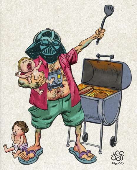
For my cartoony-er stuff I really like to pour on the garish colors. When I have these weird and ugly types of characters I feel it adds to the fun if they have green skin and orange pants and purple hair. I make every effort to control the color in most of my work, but for the wackey-fun stuff I try to ignore it if my color-sense is tingling.

One of the hazards of my occupation-- illustrator and graphics guy for a newspaper chain-- is the printing process itself. Everything I do runs in several newspapers and is printed off of-- I think-- three different presses. During a print run quality varies. As ink runs low it is replaced on the go; so, for example, you will see some copies are running low on magenta and the colors seem dry and rusty, then, when the ink is refilled you will find vivid or over-saturated copies. This can happen with ALL the colors so there are many interesting variations to be had.

And then there is the registration of color plates. One of our presses in particular, as I understand, is very old and there is a good deal of off-register printing coming out of that one.

To top it all off newspapers are printed on newsprint! Considering all these factors I've come to regard each copy as a monoprint of sorts. Unique! One of a kind!

So the point of all that was to say that I've found, by using a reckless palette, no matter how dried out or oversaturated or off-register an illustration happens to print, it retains it's characteristic madness on the page even if it comes out much differently than I'd hoped for.

The End.

Jam Dude

I have obviously run into some kind of a wall these past couple weeks. I've been busy, but should have been able to get something new together. Nope. Here's an old thing.


This is a doodle-painting I did a couple years ago for my deceased blog.

Something new this week! Maybe for sure.

Too Lazy Today

I've drawn a few things this week, but I just don't feel like scanning. Later. So, in the interest of making it look like I'm on the ball, here are a couple acrylic things I found on an old zip disc. I'm guessing they are about 10 years old, but they might be slightly younger than that.


Sorry they're so small. I recall these were on my very first website (AOL homepage thingie) way back when. I made all the artwork very tiny because it would take a loooong time to upload back in the days of the 16k (or whatever) dial-up modem.

I'm pretty sure they were drawn from some American Heritage books I picked up at a library sale.

The End.

Saturn's Seven Vipers


*Accidentally deleted this 2006 post while tidying-up the blog. Trying to restore it to its old spot, but lost the comments. Dang.

I felt so bad about my previous post that I thought I'd try to make up for it by showing an even-older old thing. This might have been my first attempt at doing one of those faux sci-fi covers I like to mess around with. I set out to create a space-heroine with the body of a Peter Paul Rubens-Girl -- I probably got carried away in a place (or two) there, but I don't think it violates the overall intention.


I was still new to the whole digital painting thing and I obviously loved being able to zoom way in and work on tiny little details. I've attached a close-up of her helmet where I wasted some time with this new power; If I had considered that the distance from the top of her helmet to her chin is less than an inch print size, I probably wouldn't have fiddled around so much with it.

Eating Contest!

I've been busy this week, so I offer up this slightly old scribble I did for work. It ran in black in white so this is it's color debut!
As I recall, this accompanied a light-hearted opinion piece lampooning the "eating contest" as a symbol of the decadence of western culture when the rest of the world is starving blah blah blah.

All I know is it makes me hungry to look this.

Sorry for the gross little cartoon– I have a couple of new things to show, but I haven't scanned & colored them yet. Soon! Again. Sorry.

The End.

Quick Doodle

Done with pencil and pitts and then stained funny colors in photoshop.


That is all.

Vader's Day

For my job, I'm working on a graphic presentation for Father's Day, and to make a long story very short, this sketch is not it.


During the brainstorming session it was mentioned that perhaps it would be good just to take one "father figure" from the story and make him the main art. Well, the text is a series of pieces by several staff writers about fathers, real and fictional, in various entertainment mediums. That's a lot of writers and that's a lot of fathers. To pick out Vader as the big representative won't really work. The tone and subtopics change too much to house them in a big, goofy, humorous MAD magazine style graphic.

But, I doodled this rough idea just for kicks and inked and colored it while I worked on the real assignment.

Anyway, not to make a big deal out of; it is merely a simple cartoon-- not even well designed. I just wanted to show it to somebody. Here you go!

The End.

Digital Dining

A fun cartooning assignment I had at work last week.

For this illustration I sketched the characters in pencil and roughed out the design on typing paper. I'm trying to cut down on the amount of time I sit in front of the computer when I do my illustrations-- I've been working only with the computer for the past few years. The deadline pressures of the newspaper call for things to be done quickly and I've used photoshop as my tool to the exclusion of all other methods of picture-making. Chronic shoulder pain and a sort of creative-claustrophobia have driven me back in the other direction.

I really enjoyed drawing these characters, each of them on their own legal-sized sheet of paper with a blunt, dark pencil. Of course, I scanned them in, arranged them just so, redrew most of it-- sort of "inking" the original drawings on another layer-- and then added the color. Still, it was a fast process and I'm going to work this way more often. I'm aware that it's not even close to breaking with digital art but it is about as far as I can go right now.

p.s. Forgot mention that this was for a story about technology and food. Now you can look up recipes with your cell phone while you're shopping-- there was more to it than that, but that's all there was to my drawing.

Online Romance

Pen and ink drawing. Really! I obviously referenced that famous Charles Dana Gibson image.

Well, to confess, I drew each character on their own sheet of paper and then drew two computers on their own pieces of paper. After that I arranged them after scanning them and did a little touch up here and there. So, it's ALMOST a real pen and ink drawing.

This is-- I think-- the 4th online romance illustration I've done in the past few years for the paper. It must be a hot topic.

The end.

Venus Needs Men!

This is the game for which I created art! It's not available yet, but as I understand, it will be shipping this month. You can visit the website at www.venusneedsmen.com and take a look at what it's about. I thought I'd show the box art here and a few of the roughs I did along the way.


The game seems to have a light-hearted, "pulpy" feel and during my initial communications with game-designer John Velonis I really got the feeling that this was going to be a lot of fun. And it was!

As I recall this was the progression of the main art's design, more or less. I didn't do a bit of it on paper, it was photoshop all the way through. That's also true of the many black and white cards, a few of which were seen in the previous entry.


These are just a few of the unused scraps that I found in the reject folder.


To prepare for this project I looked at a bunch of old sci-fi art and EC comics, just soaking in the pulpy goodness until my eyes could see the world only through Wally Wood colored glasses.

It was great fun and I hope it shows.

The End.

Game Art

Here are a few drawings I've done for a board game. Full story on that very soon: