Hey, my blog is still up. Might as well see if it still works. I'll just pretend like it's the next day.
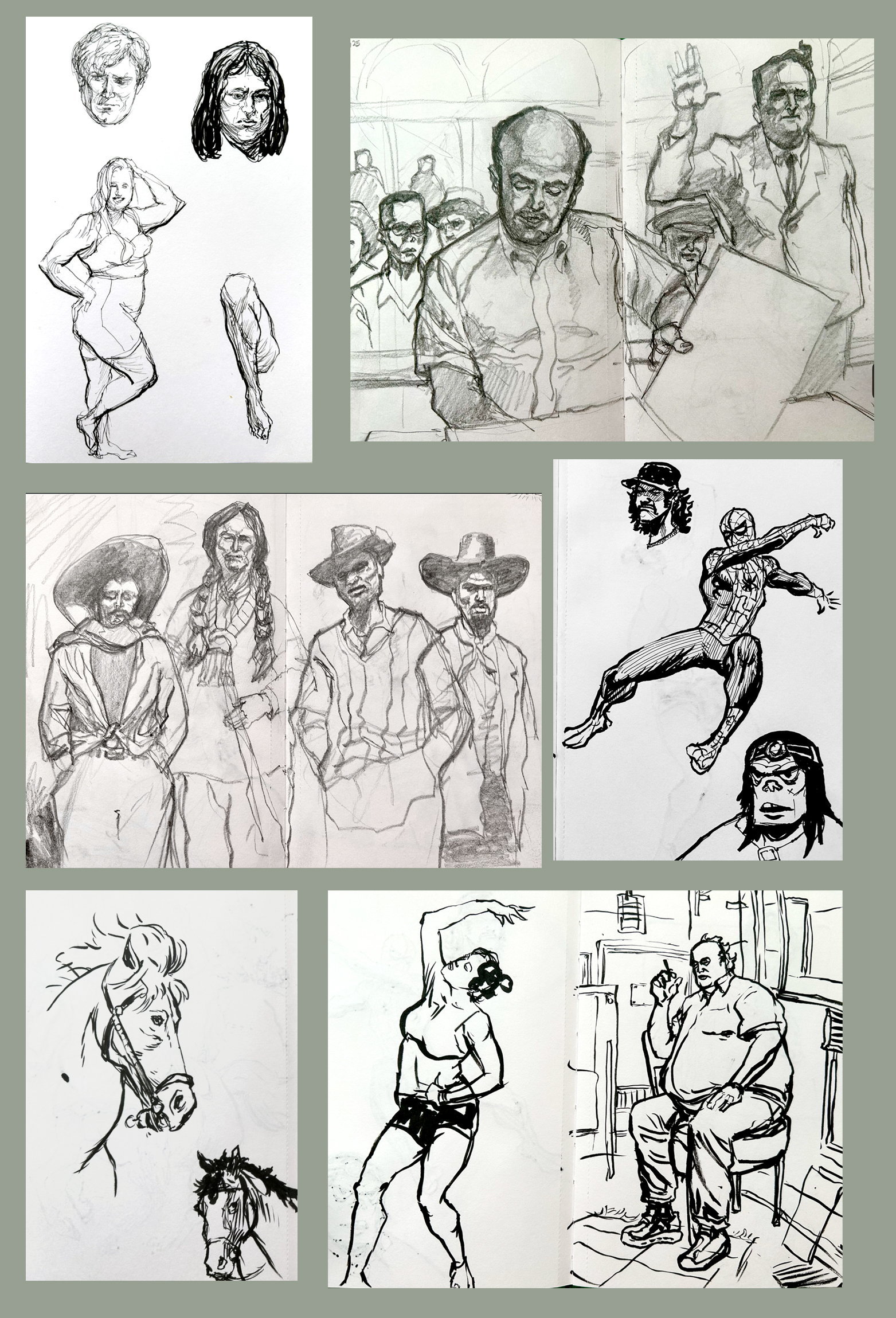
I took a week off of work and it was good to have a break. I hoped to find the time (and the drive) to ignite some of the personal projects I've been daydreaming about, but I conjured nothing of substance. Chores and practical diversions chewed up most of my anticipated free time. I did manage to doodle this little collection of characters, though!
 |
| Drawn in Clip Studio Paint. Open in a new tab for a larger image. |
Most of these figures are out-of-my-head freestyle creations. A few were adapted from photos I saw online, although they no longer resemble the source material. A couple were inspired by people I sketched during a visit to a street fair this summer.
 |
| Drawn in Clip Studio Paint. Open in a new tab for a larger image. |
During the process I ginned up the swatches and loosely adhered to the color schemes. I thought it would be fun to limit myself to three or four colors per character and see what I could come up with. However, if I felt I needed another color I’d add another swatch or two. And in some cases I switched out colors that weren't working for me. In the end I used any color I wanted and the swatches were nothing more than a reminder that I shouldn't use too many colors.
I aimed to keep the drawings simple. I began each one using the lasso tool, blocking in big shapes, adding and subtracting as I went along and then waded in with a pen or brush tool to add details. I like the simpler ones better, generally speaking. I overworked a few of them and spent more time than I intended but I was having a good time and that's what this was all about in the first place.
* * *
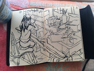
I've made illustrations for work since I last posted but I fell from the habit of sharing them here. I've shown several on Twitter just because it's easier, y'know? I felt the impulse, wrote two sentences and tweeted I them out. But I've stopped doing that, too.
But blurting out the artwork in that manner diminishes the experience for me. I can't even recall the last drawing I launched into the void. Twitter has turned into a ephemeral stream of forgettable fragments. That's okay, I suppose; I guess that's what it's designed for.
I have a young daughter and in my more pensive moments I believe that a blog of my work, accompanied by some of my thoughts about it, would be a more substantive memento than a rat-a-tat spray of tiny images and abbreviated captions lost in a nearly unsearchable database. I might try to revive this blogging habit for that purpose.
Now I'll post this to twitter, too! Rat-a-tat!