Three Little Paintings, Plus One!

I found three old thumbnail-ish doodles on the computer the other day. I made them several years ago. I was trying to get back into drawing and painting personal work for artistic growth and pure enjoyment – an effort I undertake from time to time – but on that particular occasion I only lasted about three days. "One little painting a day," I said. I sustained the pace for three days and I haven't seen them since.

Last week I stumbled upon them and – inspired for the moment – I decided that I would take up the task once more. "I'll finish the last panel – down in the lower right corner, still blank – and I will post them for all to see,” I said aloud. There was a cat perched on the shelf next to me and she seemed to nod in agreement, or maybe she was just cleaning her paws. Looked like a nod to me.


Painted in Clip Studio Paint and Photoshop. Open in a new window to embiggen.

I started the new thumbnail but made the mistake of looking critically at the ones already done and I decided that I really should fix them first. “After all,” I reasoned, “they're old, they no longer represent the artist that I am now; and besides, they aren't very good.” I’m my own second-worst critic; only my daughter dislikes my art more than me. She is never impressed.

Over a couple of days I spent several brief runs of “spare time” dolling up the old drawings and making a new one. I don't know that they were improved by the attention, but I did get to spend some time creating art, or whatever it is that they are. 

At any rate, I intend to make this a regular thing once again! More regular than three days this time. I’m certain of it! Really.


The End

Three is Better Than One, I Hope!

Three illustrations! I'm not motivated enough this evening to work up a separate post for each one but I'm in the mood to clear the deck. So, to get them out of the way – one of them has been lurking in my "draft" list for over a year – I'll just line them up and knock them down.

*     *     *     *     *

This was for a story about robots taking over the jobs of people at Amazon... I think. This is the one that's been lurking for a long time in my draft file. I can't find the pdf of the print version and a quick, half-assed web-search yields a bazillion stories about Amazon and robots and Amazon's underpaid, often shafted workers, but not this story. I shouldn't wait so long to post stuff!

Drawn in Clip Studio Paint and Photoshop, I believe.

*     *     *     *     *

The next illustration is for a story that ran just a week or two ago about the conspiracy theory consumers who have spent too much of their lives gazing into the abysmal internet and either pretend to believe or actually do believe some really stoopid crap. This time the deep-thinkers are sure that the California wildfires have been set by the secret cabal that includes the shadow government, Mark Zuckerberg, Sergey Brin, and so on.

I don't know. How secret can any cabal be if it's got Zuckerberg in it? At any rate, the illumi-nutty are sure Zuck's got satellites armed with lasers so he can start forest fires in California to help him rule the world that he kind of pretty much rules already.

The story, by the Mercury News' great science writer, Lisa Krieger, is here. She is, as always, measured, mature and insightful. That's why she writes and use I crayons and make pictures. If were to write that story I would use the adjective "stoopid" at least twice in every paragraph. 

I'm not without sin; I am an eager audience for a good UFO or sasquatch story, but I don't believe any of that stoopid crap – well, I don't believe most of it. (Would anyone in 1967 think to put breasts on a gorilla suit, as seen in the Patterson film? That would have taken a mad kind of genius. But I digress.)


Drawn in Clip Studio Paint with a touch of Photoshop.

*     *     *     *     *

This ran in early November with a story by Erin Baldassari, and you can read her fun story here. The Bay Area Metropolitan Transportation Commission hosted a competition for ideas to help ease the horrible traffic situation in the San Francisco, Oakland, San Jose areas. They received hundreds of submissions and Erin picks out some good ones that were a tad too outlandish work, although they might just the things to make it all better if life were more like a Looney Tunes cartoon. 

Drawn with Clip Studio Paint & minor Photoshoppery.

That's all folks!


Rent Control

This one was good fun! Somebody else came up with the concept, darnit, but I enjoyed the process of drawing it an awful lot. Two people, one long-term tenant with rent control and another person moving in next-door and he has to pay MUCH more than his neighbor.

It's one of those things where I can see both sides of the story. As a renter, I'm all for rent control. If I ever own a house (ha!) and decide to take on a tenant I'm going to vote against such silliness.

Drawn with Clip Studio Paint and little bit of Photoshop.


I based the character heads on two random people I found on the internet, although the drawings didn't end up looking much like the pictures. That's alright! I wasn't aiming for accurate portraiture; I was seeking inspiration so the characters didn't look like one of the fairly small stable of faces that appear when I draw out of my head.

It looks pretty good to me in print, altho I could've gone a touch wider with the drawing. I thought it would run four columns rather than stretching across the page. As they say: Sometimes you never know!


In print!


The end

PS: Since it's just sitting around and doing nothing in the folder with the final, here's the rough as submitted for approval, sketched after the concept was proposed.


The very end

Brown and Newsom

There was much discussion about how to illustrate this assignment – how to show the contrast between outgoing governor Jerry Brown and his successor Gavin Newsom.  I started a Mad magazine style drawing, but the story hadn't been written yet and so it was hard to commit to imagery without knowing what the writer was going to be focusing on.

Ultimately the decision was to do simple portraits – that was fine by me because there was a lot of other work to do and he deadline was pretty close; it definitely would have been a strain to cartoon and arrange a flurry of items signifying the differences between the two governors.


Jerry Brown and Gavin Newsom drawn in Clip Studio Paint and a little bit of Photoshop


Of course the story ended up being postponed for about two weeks because the coverage of the fire in Paradise California bumped it down the road. But that's the biz.


I really like how it looked in the paper, as designed by the always fabulous Chris Gotsill.

The end

Leaving California

This effort is similar to the 2018 NBA Finals Preview Section cover – in my previous post – in that it is another illustration where I didn't draw a thing. I took the California state flag symbol, blew it up a bit, filtered it and then vandalized it in the name of art.

This ran back in late 2017; another one of those things that I lost track of shortly after I finished it and so failed to mention it here. Make-up homework for the blog – too late for credit, but here it is!


I like how it was used in the paper. Good interaction with the headline.


The end.

NBA Finals (again)

This was a cover I created for the San Jose Mercury News/East Bay Times NBA Finals Preview Section. I wasn't very fond of it when I did it but, half a year later, it looks alright to me. Initially I was going to do a drawing as I have in the past for the other Warriors Finals appearances, but maybe I was tired of drawing LeBron, Steph, etc. It's really remarkable that it was the same showdown four years running, but it seemed tedious at the time.


Top to bottom, I used the photos of D Ross Cameron, Nhat V. Meyer – staff photographers for the Bay Area News Group at the time – and AP's Morry Gash.

The End

PS: Ha! I just found this in the folder with the cover image file – for a very short minute we were going to try to tie the Finals in with Star Wars somehow, so I came up with a quick collage rough for that. Clearer heads prevailed (as in wtf were we thinking?) and NBA Finals Episode IV was the sequel that never came to be. Probably one glance at Yoda Klay killed that whole idea. Gah. I like that Death Star basketball in the background, tho.


Robocalls and Robocalls Revisited

Hello, Blog, it’s been a while. Will try to pick up the pace.

I finished the illustration on the right last week. The illustration on the left ran about three months ago and the new story was sort of a follow-up on the previous one; it gave me a good excuse to repeat myself in a fun way. Of course I spent too much time trying to come up with something new because I’m always a little hesitant to recycle, but common sense eventually kicked in and all was well. 


Drawn in Illustrator and Photoshop


The three efforts below have been drawn over the past few months, but I'm not all that enthusiastic about them, to be honest, and I don’t believe I’m going to get around to creating separate entries for them, so I’ll just pin them up here as a way of fluffing up this post. Pardon the padding!

Drawn in Clip Studio Paint and Photoshop

That's all for now!

I Scream, You Scream...

Here is an illustration that ran in the Bay Area News Group family of newspapers. It's for a multi-part story about the best ice cream in the Bay Area, and it is written by my long-time colleague Jessica Yadegaran.

This is the third in a series of similar stories and illustrations, the previous ones were for best Bay Area tacos, and best pizza. I just leave the race track there and fill in the food of interest. They've been fun and easy assignments, a nice change of pace from the usual grind.

Drawn with Clip Studio Paint and Photoshop.

Also created an animation for the online presentation; this might take a second to load. Created with MOHO 12 – which used to be called Anime Studio – a nifty little animation program. I don't know what MOHO means. It's been fun to play with and I think I'm starting to get the hang of it.


The End

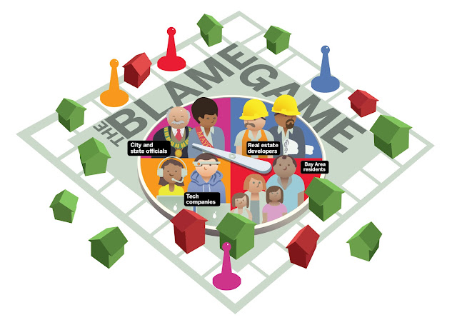
The Blame Game

I created this illustration for a Bay Area News Group online special report published on Sunday, April 8. The Bay Area housing crisis! The influx of people from far and wide coming for jobs in the high-tech industry! Real estate developers and City Hall at odds as to how to create more homes! Greedy landlords and tree-hugging environmentalists gumming up the works! Bay Area residents looking on helplessly and in horror as traffic gets worse and worse... and worse!

All those topics (and more!) have been herded into one story by ace business and real estate reporter Marisa Kendall, and you can read her excellent work right here! She's done a heckuva job and really touched a nerve with this effort.


Created in Illustrator. No Photoshop, no MangaStudio! Pure vector, which is so unlike me that friends may worry.


The webpage was arranged and designed by graphics chief, the great Pai Wei. I have another little explainer graphic set up like a slide-show about halfway down the page. It's a series of spot illustrations and all of the heavy lifting (meaning the writing) was also done by Marisa Kendall.


Hindsight afterword:

Ugh! There are a few of annoying tangents that I missed but otherwise, I'm pretty pleased with how it came out. There were so many iterations of this concept and design that I probably was a bit snowblind when the deadline arrived. "Huh? What? Yeah, I'm done. Here!Take it! Take it! I'm going home."

And I could have done better than just that gray-green color scheme for the board. I didn't want to make it too crazy colorful – and it was crazy colorful along the way – but, again, I was a bit burnt out and just waved it through.

Had a good time working on it, and as I said, I'm happy with it!


Tale of the Tape

Here is an illustration I created for the Mercury News a couple of weeks ago. Rather than try to explain what it's about, I'll just link to the special edition website with the whole story. It was written by Tracey Kaplan, an investigative reporter for the Merc and can be read here.

The great Pai Wei created the webpage.

Created in Photoshop.


It's a fab piece of journalism concerning a past incident of harassment and a possible cover-up by the Santa Clara County Sheriff. If you have any interest in such topics it's a great read, and – I almost never do this – I also recommend the comment section for a little extra spice.

Since this post is so light on detail about the creative process (not much time for it today) I'll show my rejected first effort here:

Drawn in Manga Studio and Photoshop
More art coming soon!

Vida Blue

More than just the name of a man, Vida Blue is a pleasant three syllable incantation that revives and resurrects early memories of watching baseball games with my father on a small black and white television. I was a seven-year-old baseball fan, and the early 1970s Oakland Athletics' cast of characters was a roll call of strange and catchy names: Vida Blue, Rollie Fingers, Catfish Hunter, Blue Moon Odom, Sal Bando, Reggie Jackson.

Created with Clip Studio Paint and Photoshop. Open in a new window for a much larger image.

I suppose Reggie Jackson might sound pedestrian compared to the others, but he was such a great character and such a great player that "Reggie" became a name of royalty, and achieved an other-worldly mythic resonance.

The A's were a big deal when I was in elementary school. World Series champs three years in a row, and Vida Blue was my favorite, probably because he threw lefty like me.

I've contributed illustrations to the annual baseball magazine several times – The Mercury News baseball season preview mag – but this is the first time I felt personally connected to the topic. I was given a choice of stories to illustrate, but the instant I heard "Vida Blue" it was settled. I didn't even want to know the hook of the story, I was in.

The story's hook, though, helped me figure out what to do. Vida Blue Hit the Big Leagues in 1969 with the A's and served two stints with the San Francisco Giants, ending his career wearing the orange and black in 1986. Seventeen years, he pitched. Six-time All-Star, American League MVP and Cy Young winner in '71; he was the youngest American League player to win the MVP in the 20th century.

I didn't have all of that off the top of my head; I had to look it up. But personally, although the stats back up my impressions of him – his greatness as a player cannot be doubted – it is the sound of his name and the pleasant memories of watching the A's broadcasts with Pop on Saturday afternoons that I remember.

Pop and Kerr in 2020

Made this silly little drawing for the Mercury News sports section. It ran in print and online today, March 8, 2018. You can read the excellent story – written by the excellent Melissa Rohlin – by purchasing an archaic (or "retro-cool") printed-on-paper newspaper facsimile of the Mercury News or The East Bay Times at your local newsstand or – if you have no idea what I'm talking about – just click this link here!

It's a nice story about a couple of famous sports figures who, by all accounts, are pretty good guys, too.


Drawn and colored in Clip Studio Paint and Photoshop.

Mariah's Story

This illustration ran with a story that was published on February 11th in the East Bay Times/Mercury News newspaper and website. Longtime colleagues Matthias Gafni and David DeBolt reported on this one, and they did a terrific job. You can read it online right here.

Open in a new window for a much larger image.

I worry when I'm tasked with creating illustrations for stories that are controversial or sad – it's too easy to offend; it's too easy to hit a bad note. I fear I might hurt the feelings of those who the story will impact if the people involved are victims of misfortune or tragedy, but there was no way out this time. The direction was suggested by the editors and after a teary reading of the first draft, the drawing began to take shape.

I found a picture of my daughter taken a couple of years ago when she was Mariah's age – there are so many of her on my phone – and used her body for reference. I drew a likeness of Mariah from the photos included with the story and merged it with the figure drawing. It was a sad process. I didn't like doing it at all.

The first pass of the drawing was initially in sepia and a bit of pink but, as you might imagine, it seemed awfully brown. I tried to find a way to bring in more color without softening the mood, and above is the final result. I'm glad it came out as rough and "unfinished" as it did and I'm pretty comfortable with its attitude. I'm happy with how it turned out, but looking at it does not make me happy.

I wasn't sure I was going to post this; it has been waiting in draft mode since, well, since a few days before publication. I didn't want to take the time to write about it. There's been too much bad news about little kids lately, but here it is. It's not comfortable but in light of the events of this week – more kids lost to gunfire in school – I thought I should show a little courage, a little courage for the kids that have been failed.

The end.


Messing Around With Moho

Here is a short animation I put together recently. I've been working on the character and the background during quiet moments; finally put them together and made them move and wiggle with Moho Pro 12 (formerly Anime Studio.)


I can't describe the joy I felt when – after days of frustration and study – I got the rigging and switch layers to work. Not an exciting animation I guess, but hey! Progress!

*      *      *      *

This is not a commercial, but:

Years ago I bought Anime Studio, eager to try animating on a computer. The learning curve was steep. I had no digital animation experience and no friends with a shared interest. That left me sitting alone, reading the pdf instruction booklets and trying to mimic written tutorials. YouTube had very few instructional videos at the time, and those I found weren't much help.

I managed to fight my way through the fog and put together a modest project or two – each one running about ten seconds – but there was a lot of trial and error. It was fun in the way that learning new things is always fun, but I burned way too much time trying to do more advanced things without being able to do the basic things consistently.

Recently I ran across the Udemy site, and they had a sale on Moho courses: "The complete rigging course – Moho & Anime Studio" by McCoy Buck, and "Anime Studio Pro 11 – A practical training course," credited to Simply edukator.*

They really did the trick for me.

I know, I know... there are dozens of tutorials on YouTube now, and most of the information is out there, but the structured courses nail the tips in place. When I (frequently) forgot how to flexi-bind or bind a switch-layer folder to a bone, it was easy to find my way back to the video that shows you how, and the videos are about 5 minutes a piece so it's not difficult to scrub through and find the relevant info. That's just one example; I was frequently baffled and forgetful, and I never had to thrash about blindly hoping to find the solution to what was vexing me.

And the courses cover a lot of topics you won't even know about if you're like me and your attention wanders while you read through the SmithMicro Moho 12 Tutorial manual. That is one tough manual for a newb.

McCoy Buck has put some chapters from his course on his YouTube channel so you can check out his teaching style there; the Udemy site also has some samples. Again, highly recommended!


*At the time I'm publishing this post, I don't know the name of the person teaching the "Anime Studio 11 Practical Training Course," but when I find out, I'll edit his name in here and provide links if he has something to link to.

There's a whopping ten hours of video on that course, and I haven't gotten through half of it yet, but it was a huge help. Skimming over it again, I see a lot of things that I will be referencing in the future.

The End For Now

Another Silly Animation

Short post:
Made a silly little animation using MOHO 12 for a story that ran on the Mercury News website by longtime colleague Jessica Yadegaran. It was fun to cartoon it and lots of fun to make it move around a bit.


Drawn in Clip Studio Paint and Photoshop.


Random Heads

Head sketches based on mugshots found on the innernetz. Used one those floppy brush pens that gush, dry out, gush, dry out. Hard to tell what you're going to get from beginning to end of each stroke. Great Fun! If that's your idea of fun. (I hate it.)


The End

Patio Sketch

Quick sketch on the patio early Saturday morn. Drawn in Clip Studio Paint on an iPadPro, puny size (get the big one if you want to draw on it; the small one is alright, but a bit frustrating) Took about 50 minutes. Stopped because it was COLD out there!


The End