Showing posts with label Best Newspaper Work of 2012. Show all posts

Bay Area Hobbitats!

Here's a bit of fun!

Angela Hill had an idea for a story highlighting places in the Bay Area that might fit in to a vision of Middle Earth. She's a Tolkien fan and, for inspiration, she even loaned her copy of "The Hobbit" illustrated by Alan Lee. Her story is here, and it's very nicely done!

"The Hobbit" was a passion for me in my tweens and teens; I couldn't even guess how many times I read that book. Lots. I knew this would be good fun for me.

Open in a new window for HUGE version.

Secretly, I dread these kind of map illustrations. Well, not so secretly now, I guess, but it's just so dang hard to get things to fit!

This was a quick turnaround, so I didn't have time to fret over each bit. It was a straight forward sprint all the way. I was really worried about how it would look until a couple of hours before it was due. I wasn't certain I could fill the page but I had to discard a few other ideas because I couldn't wedge them in comfortably. Which was good, because it took much longer to color than I thought it would, and another 5 minutes spent on the drawing would have sent me tumbling into the deadline crack of doom.

Still, I wish I could have worked in a gag about the Oakland Raiders. And Iwas going to have Gandalf and Bilbo saying something like "How strange this place is." "I knew we should have taken a left Lothlórien." Or something nerdy like that.

Jennifer Schaefer designed the page, guiding me along the way; and here's how it looked in the paper:


I drew everything except for the dragon Smaug at the bottom. I traced it from a picture of the cover to the first edition of the book. I thought that would solidify my Tolkein-geek cred.

The End.

Why Do We Like To Be Scared?

It is weird, isn't it? As a kid I could not wait for Friday and Saturday nights, when "Creature Features" would be on waaaay after bedtime. I'd sit on the floor and Pop would sleep on the sofa with his hand dangling over the edge so I could hold on when a scary part would come on. I saw all the Universal Monster movies that way; and the Godzillas and even some of the Hammer films. Loved that stuff!

Open in a new window for a huge picture.


When I read the story topic for this assignment I thought of an interview with Boris Karloff that I saw (or maybe read) years ago. He said that when he was recognized by children as the Frankenstein Monster, they wouldn't run away, but they would come right up to him.

Maybe that's because the character was a child-like, sympathetic creature and children connected with his portrayal of the misunderstood monster. Has there been a better or more timeless performance in the history of cinema than Karloff in "Frankenstein" and "Bride of Frankenstein?"

But, tossing that out, it is peculiar that so many of us rush with arms open to scary movies and frightening literature. Personally, I am appalled by the thematic and visual ickiness of "The Walking Dead," -- a show I would not recommend to anyone -- but I just finished watching season 2 on Netflix and cannot wait until the next season gets there.

Inspired by the vision of children eagerly walking up to Mr. Karloff, I came up with this image as a representation of the story angle. It's kind of fun and it gave me a chance to play with a Frankenstein Monster drawing. I had a great time!

Click here to read the story by Angela Hill.

Here are three snapshots of the image as I worked through the process:

Click for a new window for this one, too. Pretty big.
There wasn't much variation from start to finish, that's for sure. The first one is the only thumbnail I came up with.

The second picture is what I sent to the editors for approval. I wasn't planning on such a highly-rendered illustration at this point. It was likely I would refine the drawing and slap down some color; but I when I saw that I had a few days ahead where there would be time to devote to a more work-intensive presentation, I went after it.

The rendering process went faster than I thought, because I'm programmed to work as quickly as I can no matter what. That's just part of the deal in newspapers. I've had "Can you have this project done two weeks from now, Thursday," change to "Can you have it done by 6 o'clock?" No kidding.

I shouldn't have strayed from the features of the monster in the second picture, but I lost track of what I was doing. I zoomed in real close and it almost felt like I was carving the face out of stone -- I just kept going and couldn't erase what I'd just chiseled.

I raised the top of his head so that I could put a nice, slightly gross-looking stitched-up seam to give a touch of ghastliness to an image that is way too cute.

And here's how it looked on the page:


Carved in Photoshop!

The End

Off to College

I did this illustration for a story about what to take and what not to take when you go to college. The general idea I'm trying to get across is "you don't have to bring everything! Travel light." The story (here) is more helpful than that.


I left the underdrawings in because I like underdrawings. I will confess that in several places I have faked underdrawings where I accidentally deleted the originals. When I leave underdrawings in my work I will go further and avow that I tidy up, recolor, erase and redraw the underdrawings if they don't look right to me. Why not? I think it looks cool and no one will ever know!


I was asked for spot illustrations to go on the inside pages. We could have cropped in on parts of the main art, repeating portions of the image and saving work, but I've never been fond of that treatment. As a member of the audience, I don't want to open the page and look at bits and pieces of something that I looked at on the front.


These were quick work for me and a lot of fun. I don't know if these are "my style" or not, they look different to me than my regular work, but I'm not sure what "my style" is.

I just scrolled down the page and I wonder how my work comes across. I see a variety of approaches with a similar flavor, but then I see things that look like they've been imported from another artist entirely.

Is this guy versatile or unfocused? Maybe both.


The End

Here is how it looked in the paper:


Virtual Robbery

This illustration accompanies a story about the problems arising around the imaginary economies which are a component of many online games. In some games the virtual currency can be exchanged for actual money or merchandise, so –– of course –– hackers and thieves are finding ways to steal gamers' make-believe money and trade it for real-world loot.

Wow. The shriveled, sleepy portion of my brain that recalls the pre-internet world thinks that's a weird thing to try to explain. What strange things the 21st century hath wrought!

Open in new window for huge version.

I received the assignment on an already busy Thursday. There was a concept that the art director and page designer had tentatively pitched, but they weren't really enthusiastic about it. I started to flesh out that idea at the very end of my shift, but I paused and did the rough sketch below, on the left.

I've never played World of Warcraft but that's what I think of first when I hear "online games," so I pushed in that direction. "Almost there," I thought. But would anyone else see the connection?

Gosh, that second one looks like a Sergio Aragonés gutter drawing. That's cool!
I had a cookie, went into my thinking trance and solidified the drawing. Then, I put those health-bars over the characters' heads. DING! Whew. That's it.

I pitched the thumnail in an email before I went home and it was given the thumbs-up. When I arrived at work the next day, I only had about 5 or 6 hours to get it done, so I sprinted forward without straying much from the roughs. The drawing part was pretty swift but I explored a couple of different coloring approaches, which was fun and I'm glad I took the time. I like how it came out.

I didn't mean to make it so cute. I try to save that for my features illustrations, but it was crunch time and not wholly inappropriate. 

Here is what it looked like in the paper:


The End

Over The Top

I drew this the other day. I'm pretty happy with it. Five caricatures and they each kind of look like who they're supposed to look like. A resemblance to the person being caricatured is one of the most vital parts of a caricature, or so I've been told. Ha!

I've mentioned before that I don't have a lot of confidence in my caricature skills. I seem to do okay, but I begin each one with fear, doubt and a healthy portion of dread.

Larry Ellison was the hardest one. He's got the most character to grab onto but my first version looked like an angry Abe Lincoln – I didn't show that to anyone. My second attempt was rejected because he looked too mean and we shouldn't editorialize too much when operating in pure illustration mode. The final one here doesn't look as good to me as the angry one, but it's alright.

Click for huge!


Page designer Daymond Gascon put together the information bits and made a great page of it for the paper! It looked like this:


The End.

A Bedtime Story

I drew this to illustrate a story by Angela Hill about her quest for the right mattress! She writes with a deft humorous touch and the tone of most of my work is pretty well suited for her playful columns.

Her story is online here! (Sadly, a link now dead.)

It's a fun little illo, but drawing those mattresses was pretty damned tedious. Had a very difficult time staying focused. One second I'd be painting a bit of texture and the next I'd be on the web reading an article about Australian rules football or whatever else attracted my eye. I don't even care about Australian rules football.

At home, I have an old computer that isn't connected to the internet which I use to draw on. I get things done much more quickly there.

I put the cat in just because the lady looked like she needed a friend. It is, of course, a special guest appearance by one of my fine feline friends. Whenever I need a cat for an illustration I use one of my pride. This time, Mr. Riggs sits in.

The End.

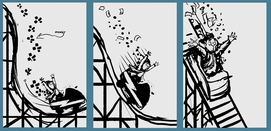
Riding Out Wall Street

I did this illustration last week for a story about finding places to put your money rather than the stock market. I've got about 35 cents in my pocket. I think I'll put it on the shelf next to my keys. That's safe! Wait! Where are my keys?


Here are the thumbnail roughs I did when I received the assignment.


And here's how it looked when it hit the page!


Sorry I'm so brief today. Company's coming and I've got lots to do! Thanks for looking!

If you like it/hate it leave a comment or tweet it at me. I'm always happy to hear from even my most brutal of critics... like mom.

Fine Print? What Fine Print?


Drawn in Ilustrator and Photoshop
Here's an illustration for a story about all those "terms and conditions" that come with the stuff we download from the internet.

You know, the terms and conditions that you've never read? Maybe, at one time or another, your inner voice has suggested that you should read them, but how far did you get? Did it make sense? Did you ever click the "Don't Agree" button, just to see what happens?

It turns off and you don't get to play.

What? Screw that. Quick! Turn it back on and hit the "Agree" button without reading the 75,000 word binding legal contract which might be telling you it's going to give your personal information to the Republicans.

You just paid them 99¢ for that privilege.

That happens with every Angry Birds download.

Well, I mean, it could. I'm not sure. I've never read that crap.

*                *                *                *                *

So, here are the roughs I offered during the planning stage. The initial suggestion was to have sinister characters made up of blocks of "terms and conditions" text coming out of a computer monitor. That sounds like a neat idea, but it struck me as better suited to a short animation, which could be cool, but not for the paper!

Rough sketches in Photoshop

I tried a simple collage approach with the genie, in a half-hearted gesture toward the suggested idea, but I wasn't too crazy about it. I hoped the editors wouldn't want to go that direction and the drawing was bad enough that it wasn't even addressed. Whew.

The snake rough and the final idea happened at the same time. But as I drew the erupting-roll-of-paper version I thought about making it a feature panel in a silly short comic of the process of buying something online. I really like it and that would have been my preferred presentation, but I'm that way with comics. (Lower left panel may not be clear, but it was the character all tangled up in the contract.)

I've been using this simple cartoony style for the past couple of illustrations and I thought I should at least take a stab at breaking it up, so I did a more "realistic" approach for the last doodle with the monster looking over the top of the monitor. Not great, but I scratched an itch.

The editors thought my feature panel on its own would be best. As the clock chimed "tim-berrr!" and the deadline began to fall, it was decided that a mobile device –– iphone or ipad –– would be better than a laptop, so I iPadded it. I think it came out pretty good!

Here's how it looked after Daymond Gascon designed the page:


The End.

Who Makes the First Move?

This is a pretty simple illustration, and there wasn't much evolution of the drawing from conception to execution, so a step-by-step description would be two steps and each step would look about the same.

My first sketch of the guy in the tower differed in that he had cigarette instead of a beer mug and he wasn't smiling. I self-edited the cigarette because the angriest phone call I ever got from a reader was about an illustration in which a character was smoking a pipe.

The outraged person called on my day off so I missed out on a personal berating, but the long, intensely angry message he left was a doozy and had me flinching every time my phone rang for weeks. The answering machine timed-out before he was able to get to the grand finale but it must have been wondrous!

I've always imagined him pacing back and forth, shrieking into the phone, waving the newspaper around in the air, spitting and cussing and foaming; yes, he was that furious. At the end I bet he slammed the phone down with a flourish – it was back when telephones could be slammed down – wiped the sweat from his brow and slumped into his favorite chair, panting, shaking, exhausted. Then, to calm his nerves, he lit a cigarette.

Ha!

*    *    *    *


Anyway. Sorry. Went off-trail there for a second.

Here is how it ran in the paper! Jessica Yadegaran, excellent features writer and long-time very patient victim of my illustrative efforts, checks to see if it's socially acceptable for women to make the first move on desirable dudes in her story here. Sounds good to me.

Not that I'm waiting around for that. I'm married, you see. And I asked her out – but she did leave a clear trail of breadcrumbs, now that I think about it.

Garden Calendar Cartoonin'


Last month I had the opportunity to create an illustration for the annual garden calendar page, and I had a great time with it. There was a comfortable amount of lead time and I was able to build up a small crowd of characters involved in gardening activities. I fell back on a simple cartooning style that flows naturally for me and the characters appeared without much fuss.


Of course I misjudged the amount of space that was needed for the text, so there was much squishing, tweaking and redrawing to do as the deadline came stomping into the room. But, aside from the final push (and that wasn't very bad, either) this was good relaxing fun for me from start to finish.

Working on the final character, I took screenshots as I made my way through the process and posted them to my twitter feed. It was an experiment, and I had a good time with it, but I don't think anybody noticed. Maybe next time.


I had several other characters roughed in as I went along but I can't seem to find them in my collection of files. If I run across them I'll tack them on the bottom here.

The End.