
The story: How technology is changing the way we get our entertainment, focusing on TV. Now you have TV on your computer, your ipod, your cell phone. The way we watch TV is changing!
The idea: The family at home watching TV on one of these newfangled devices.
First scribble: In photoshop I quickly roughed an overhead view of living room furniture around a TV. I added a clickwheel and it became an iPod.
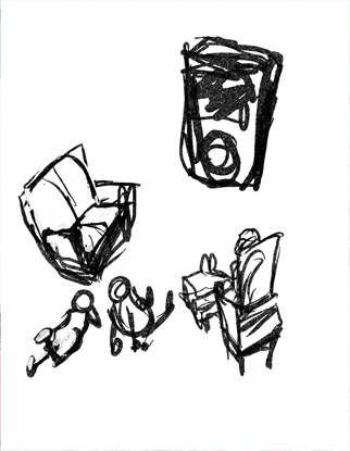
Second scribble: A quick refinement and simplification. Right here I see the whole design problem and feel that I have it solved-- with a little bit of squishing things one way or the other I have my headline and story placement.

Third: Now I struggle with style. I try to do things differently now and then. I get bored looking at my own work and seeing the same thing all the time. It may be something that can't be helped-- your style may just be what you're stuck with-- and I can accept that, but I try not to. So I fight it as best as I can.
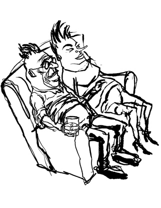 I do a lot of "cute" stuff at work. Nothing wrong with that. Cute is good for most projects involving the Living section, after all you don't want to scare away readers when they're expecting fun and informative stories about food, entertainment, etc. What I decded to aim for was a cute illustration with "ugly" characters. A less-than-cuddly looking couple on the sofa was my solution for that.
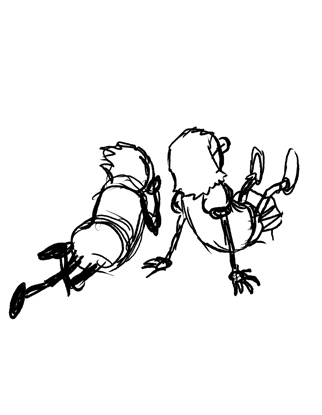
Fourth scrbble: The kids. No real insight for this sketch. It was a simple rough done in the interest of figuring them out, although-- in retrospect-- it didn't carry them much further toward a resolution than the very first thumbnail.
Fifth scribble: I printed out the rough sketch of the couple on I sofa and, on a light box, I started inking them in. I used my left (wrong) hand for most of the contour lines so that I could get a shaky/ugly vibe going. It worked well enough so that my right hand got into the spirit of things and I committed a horrible inking job. . . to my great delight.

Sixth: And then I decided... the characters were a tad TOO strange for my eye. The thought of such a "bad" drawing (intentionally so or not) running on the section front with my name under it made me wince. In a cowardly and self-serving move I re-inked their heads in photoshop before the editors saw them. Wrong? Who can say? (Probably wrong, I confess, but I'd likely do it again.)
The kids could have been crafted more strangely, but I was running out of time. I used a shaky line for them also and bent their fingers awkwardly to give the children a sense of peculiarity.
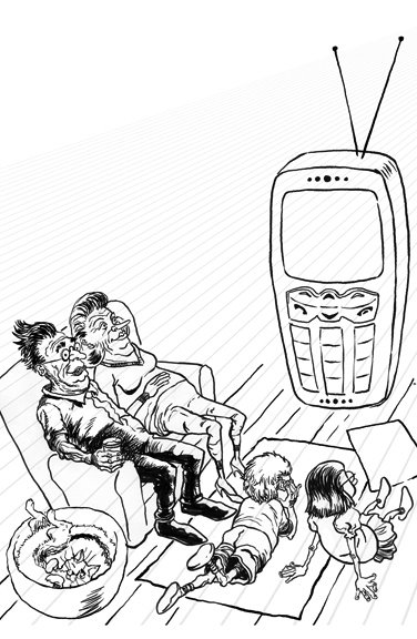
In an effort to fill up a dead-space in the composition I quickly drew up a cat. I live with cats and they are a significant (if not dominant) component of my daily life and they do manage to creep into (if not dominate) a lot of my work. Plus, if you put a cat into an illustration, it immediately cutes the whole thing up a notch!
The Final: I used a purposefully garish palette for the final. I felt unusual and outlandishly wrong color would add even more weirdness to the thing. I put a canvas texture over the illustration (more ugly weirdness) and used one of my scanned pieces of parchment for the spot where the type would go.
All in all a very unusual piece of work for me. And yet, somehow, it still looks like it's in my style. Bummer.
 Footnote: What happened to the iPod?
Isn't everyone a little iPodded out? No offense intended but was it this bad with the hula hoop? The rubik's cube? The walkman?
I admit that I have one. It's the second one I've owned. It's great and-- I kid you not-- I even SLEEP with it. (I listen to old-time radio shows in bed-- it's kind of my way of watching TV until I fall asleep.) I take files to and from work on it, I back up my work files on it, I have my website on there, my digital portfolio, current sketches and paintings and comics and reference photos and notes and so on.
BUT! Over the past two years at work not a week has gone by that we haven't had some iPod related story with graphic/illustration that we've had to deal with. Great for Apple. Monotonous for graphics folk. "Please, not another ipod story," cries the graphics department. But they keep coming.
For this illustration I opted to use the cell phone instead of the ipod because of ipod burnout, and I like the way it turned out-- really. Yet I think it would have been better if I had just drawn an ipod. It's such a distinct and attractively designed bit of machinery that it would have stood in elegant relief to the unattractively designed family sitting around it. Oh well.
And now I will post this long and probably uninteresting thing, I will go lie down, place my iPod on my chest, and listen to "The Shadow" until I drift away.
The final resolved drawing of the parents is outstanding.
ReplyDeleteThanks Ian, it was strange working on something that was sort of out of my usual groove, and then letting it go to press. I'm glad you like it.
ReplyDelete